Research | Design | Accessibility
Designing a Health Dashboard for the Everyday Person
Pursuant Health is a medical start-up created to make health accessible through free health screenings. Pursuant uses population health best practice strategies to empower patients to be in their best health. Located in every Walmart and expanding yearly, 80% of Americans live within 10 miles of one of their medical kiosk.
Today, millions of Americans visit the Pursuant Health kiosk monthly, but only a small percentage use the accompanying web portal. For this 8-week increment, we wanted to figure out the disconnect and how we could increase usage. For this project, I worked with 1 project manager, 3 developers, and 1 QA. I was responsible for research, wire-framing, final design, and developer hand-off.
Research
Before I could work on solutions, I needed to investigate what was causing the drop off. Through user reseach, I was hoping to answer the following questions:
- How are users finding our online dashboard?
- What use cases and key features are we missing?
- What results and vitals are most important to our users?
- Are basic tasks possible on our current dashboard?
I got my data from four main sources:
 Google Analytics
How are users finding our online dashboard?
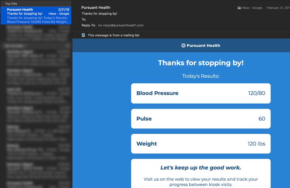
Most users discover our online dashboard one of two ways: through the results email they receive after
every visit to the kiosk and through our marketing site. Google Analytics showed the majority of people
found us through the results email. Of the many that visit, most never return. For more on how I
increased referrals from our marketing site, see
my case study on our
homepage redesign.
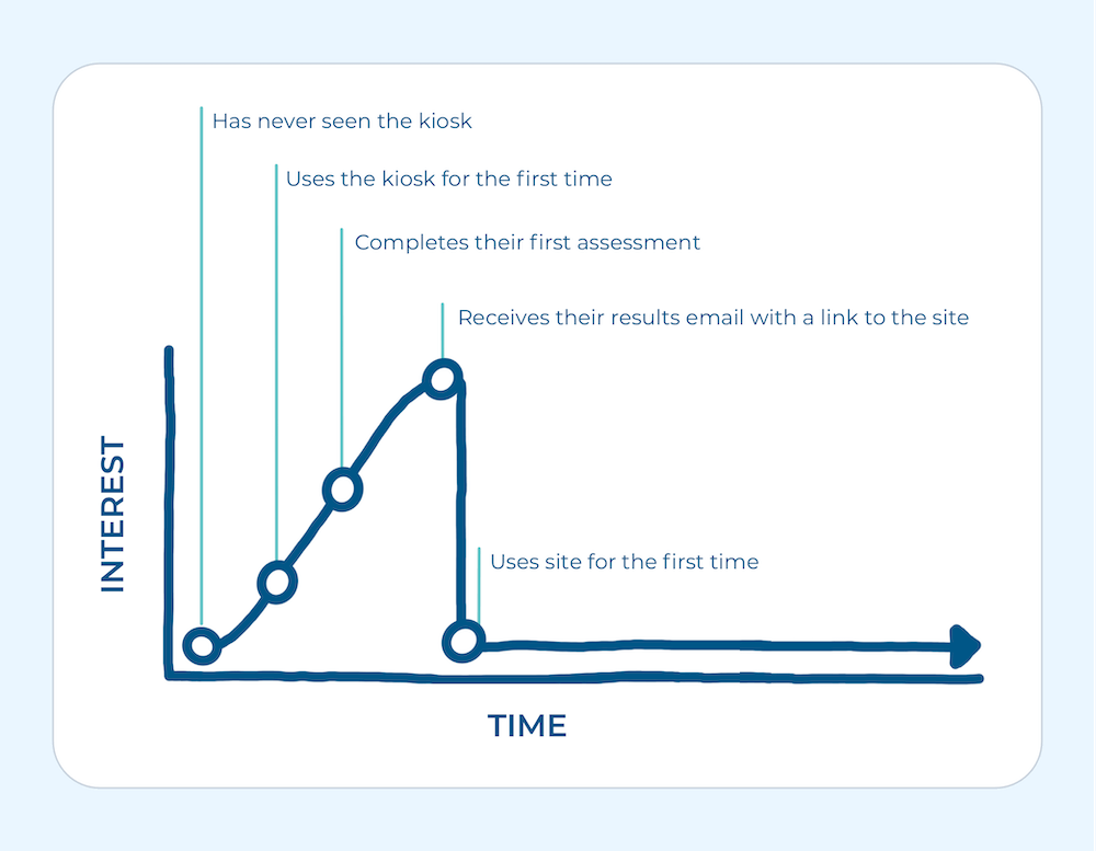
Data is representational. Exact figures and questions are confidential.
 Idea Portal
What use cases and key features are we missing?
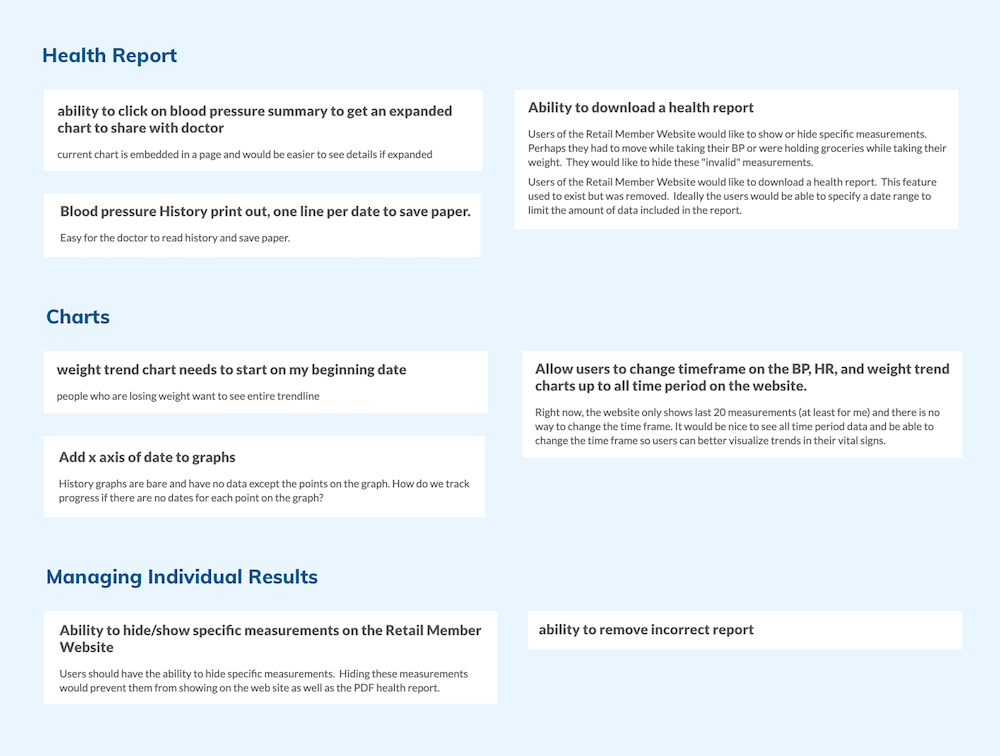
Next, I took a look at our public idea portal. Users and support representatives are encouraged to put
any gripes, ideas, or bugs here. I love getting a peak at what ideas users are upvoting and commenting
on, each with their unique use case. Immediately, a few obvious issues stuck out. I organized these by
category.
 In-Kiosk Survey
What results and vitals are most important to our users?
Given that many of our health assessments are question:response format, it was easy to tack on
additional optional survey questions, and given our high traffic, we had statistically significant data
within a few days. I kept these questions short and quantitative.
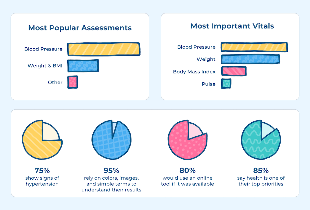
Data is representational. Exact figures and questions are confidential.
 User Interviews
Are basic tasks possible on our current dashboard?
When time and budget allows, meeting users face-to-face is vital. I was able to observe users attempt to
complete common tasks and ask more complex questions about how they typically use our products. For
example, many users were sharing their health assessment results with their doctors, but without an easy
way to download or print results from our site, the flow looked something like this:
1) Can't find a way to print results
2) Tries to comb through result emails
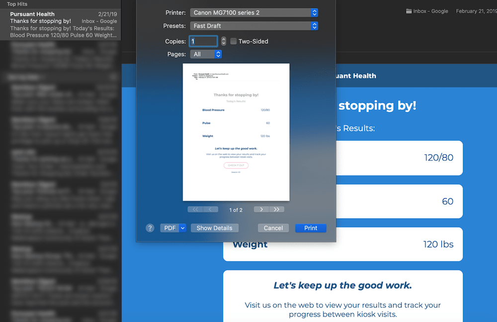
3) Prints each individual email
4) Quickly becomes frustrated
1) Locates blood pressure value
2) Googles what the values mean
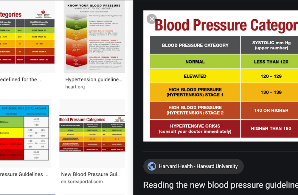
3) Skims resources looking for answers
4) Quickly becomes confused
1) Tries to read graph without units, dates, or ratings
2) Quickly becomes frustrated
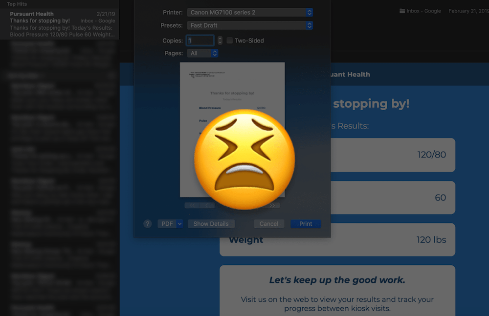
Users were getting frustrated and resorting to what was familiar, even if it was more complicated.
Analyzing the Data
With all the data compiled, I chose three user goals to focus on for this increment.
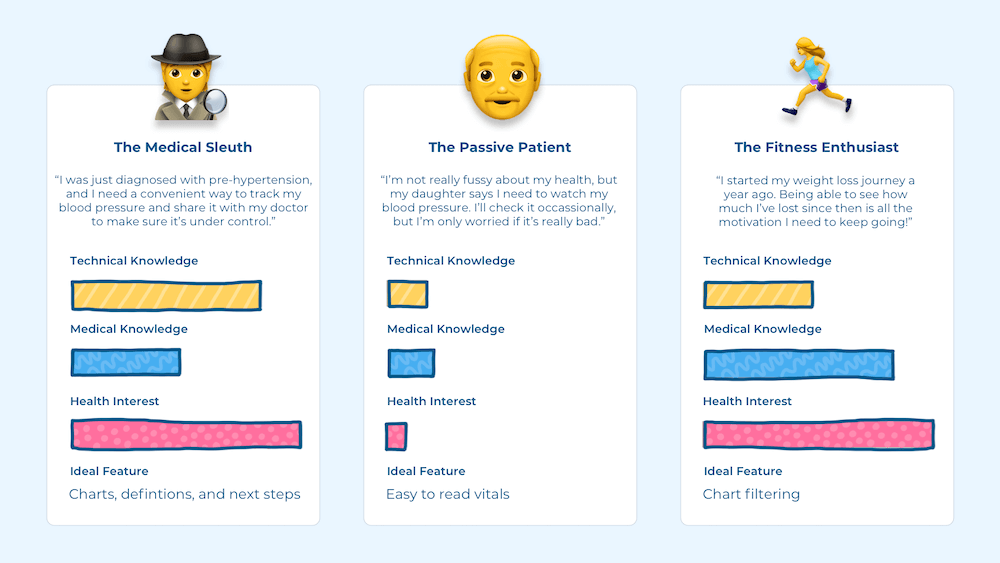
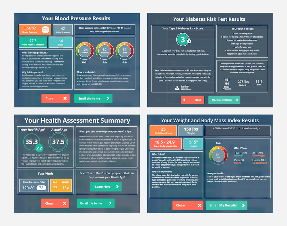
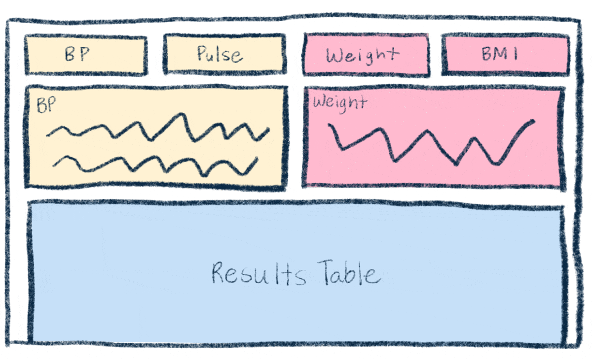
Before jumping right into design, I wanted to organized and standardize all the possible results a person could get. At the time, results on the kiosk were individual designed.
By providing consistency, it'll be easier for a user to notice dangerous increases in their blood pressure, know exactly where to look for a word's definition, and, in turn, understand their health. My favorite method for data organization is OOUX, or object-oriented user experience, which pulls from object-oriented programming principles.
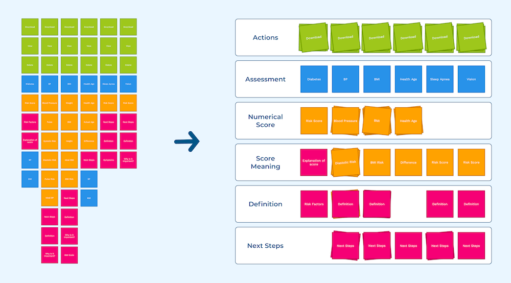
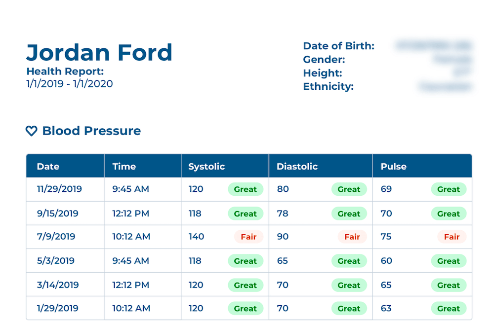
Breaking down each assessments into objects with metadata, content, and actions revealed patterns between the results that weren't immediately obvious. That means we can simplify the results from nine sections down into four, easy-to-understand sections. For example, the blood pressure assessment might look something like this:
- Blood Pressure {
- Numerical Score: 120/60
- Score Meaning: Great
- Date Taken: 01/01/2020
- Definition: Blood pressure is the force of blood against the walls of your arteries. The Systolic reading is the pressure while the heart is beating. The Diastolic reading is the pressure while the heart is at rest. A normal reading is below 120/80.
- Next Steps: It is recommended that you check your blood pressure regularly and speak with your doctor if your blood pressure readings are constantly above normal (120/80).
- Actions: {
- View
- Delete
- Share
- }
- }
With the data structure defined, I can start experimenting with measurement card and site layouts and information prioritization.
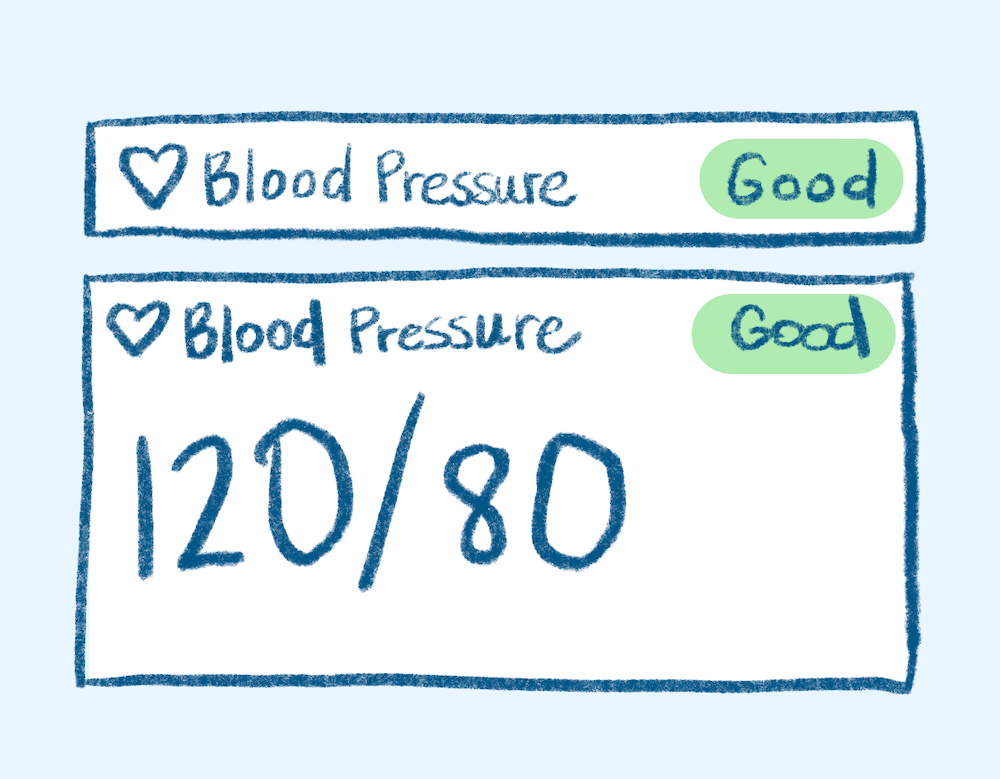
Focus on scalability, readability, and accessibility (indicator uses color and text)
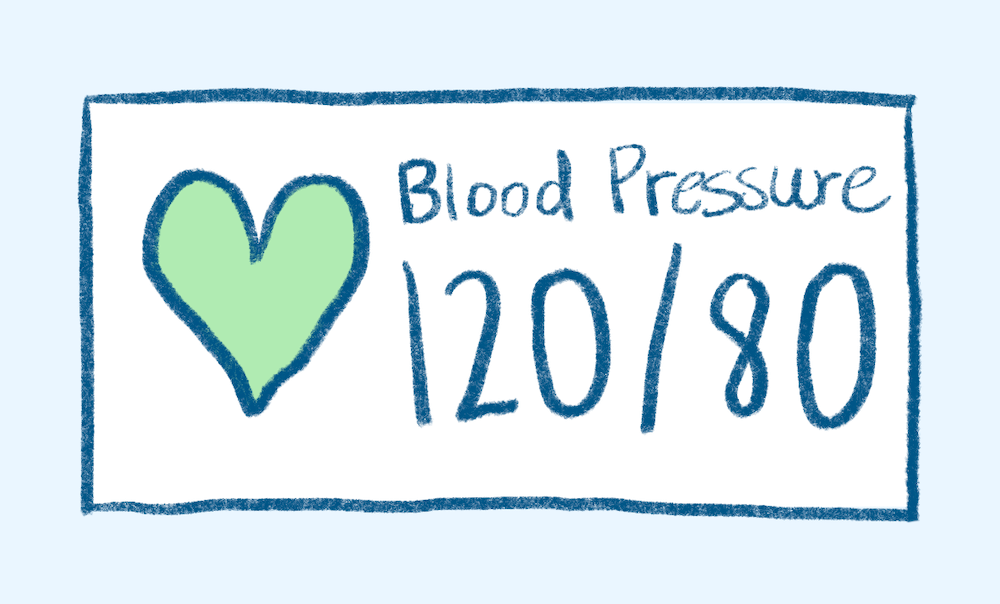
Focus on assessment icon and value
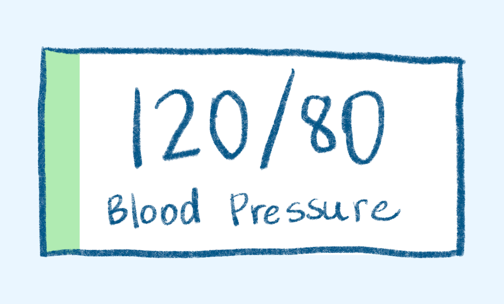
Focus on assessment value
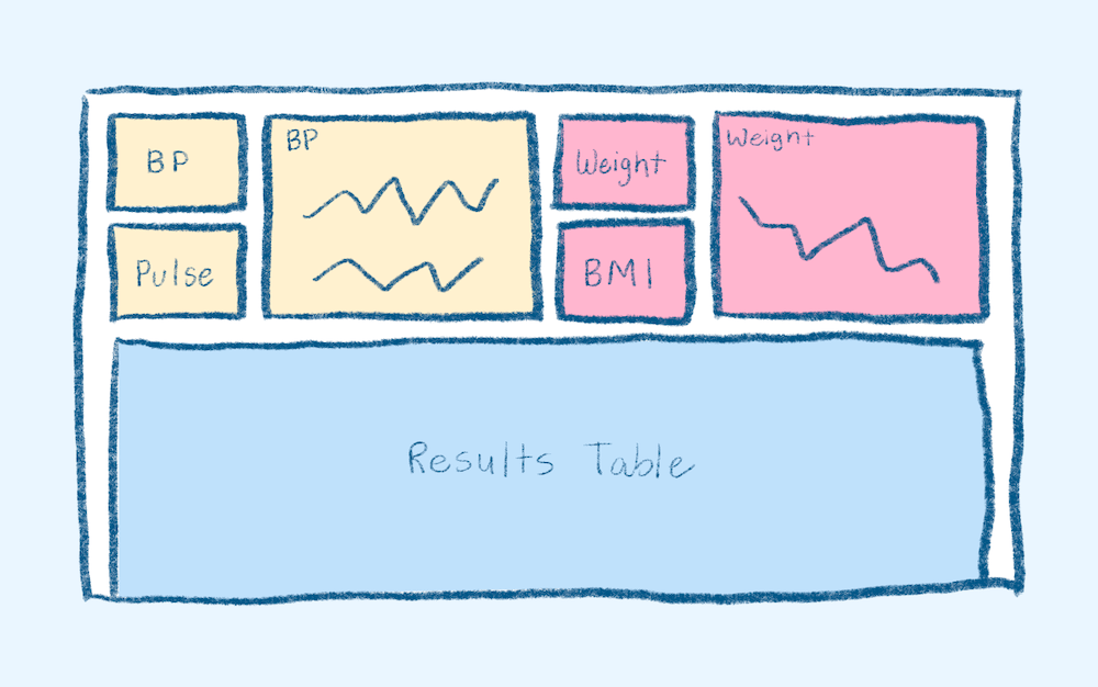
Data visualized by assessment
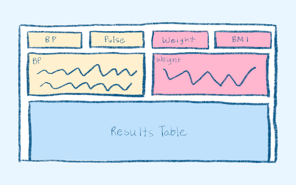
Data visualized by assessment and type of visual
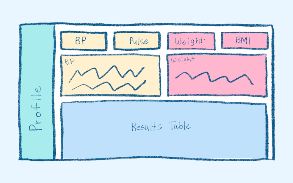
With fixed profile card
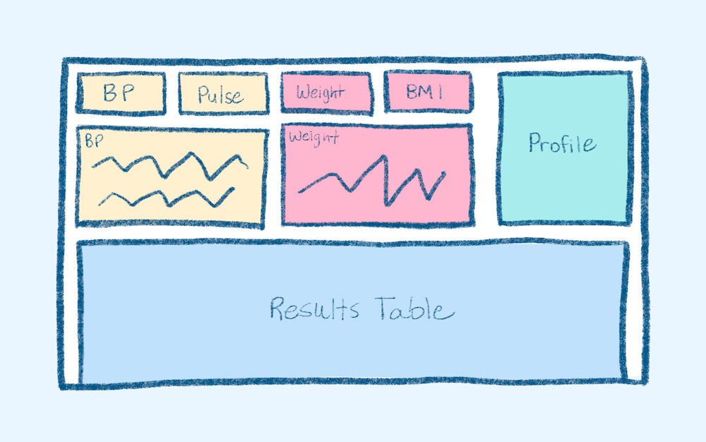
With small profile card
Accessibility Considerations
As with every project, accessibility is one of my top priorities. I was lucky enough to work for a company that shared this mission and made it an overarching initiative. With every increment, we updated out-dated designs to reflect current WCAG standards. This means higher color contrast, non-color indicators, screenreader-friendly language and layouts, and more. You can view more examples of that process in my Branding and Design System Case Study and Kiosk Redesign Case Study.
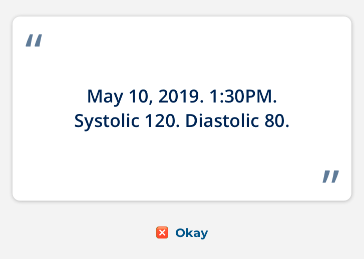
Before: screenreader text is robotic and difficult to understand
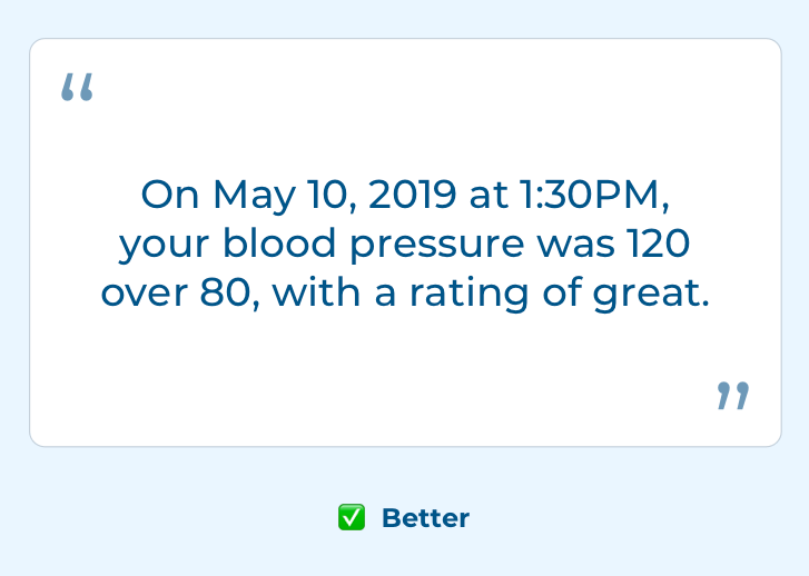
After: screenreader text is conversation and contextual
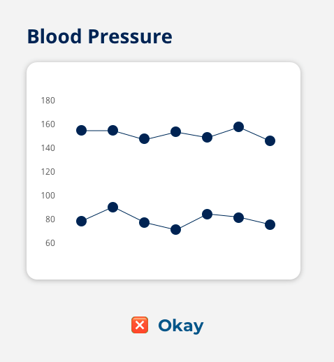
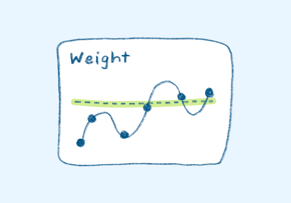
Before: graph lacks units, indicators, y-axis, and legend
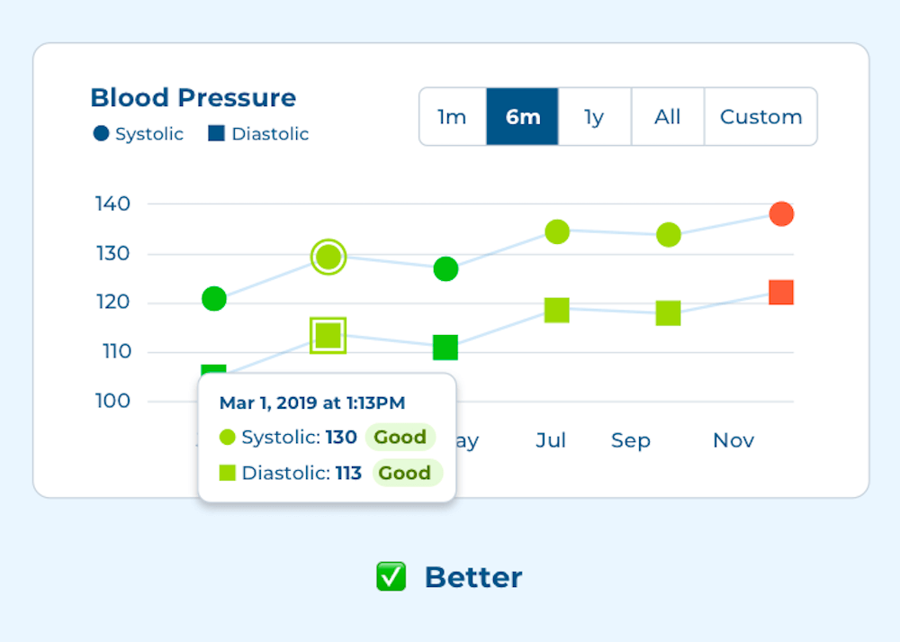
After: graph has accessible units, indicators, legend, and contextual tool tips, and customizable filter
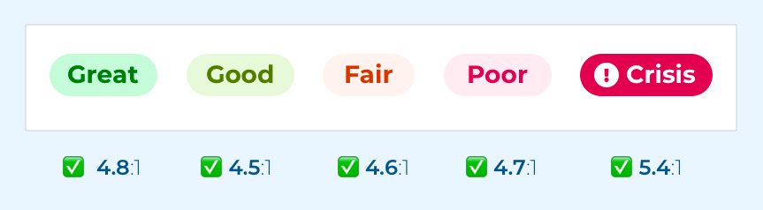
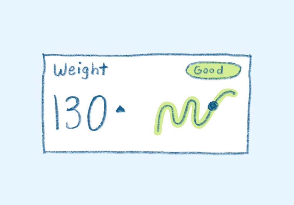
New rating indicators include both color and text and pass color contrast guidelines
Users can see at a glance if a vital is good or bad and if it's higher or lower than past vitals
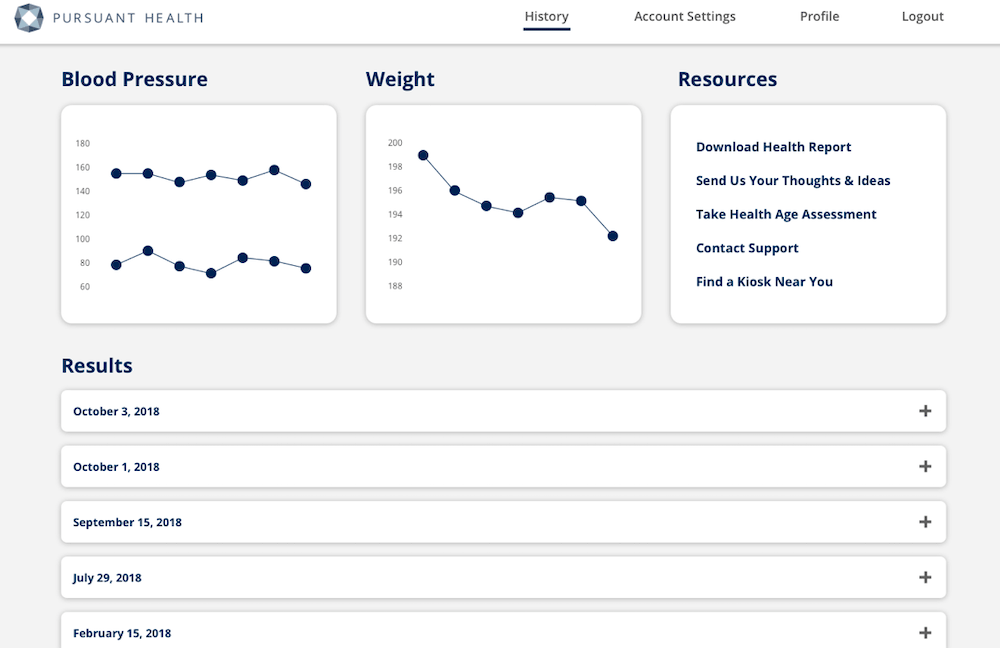
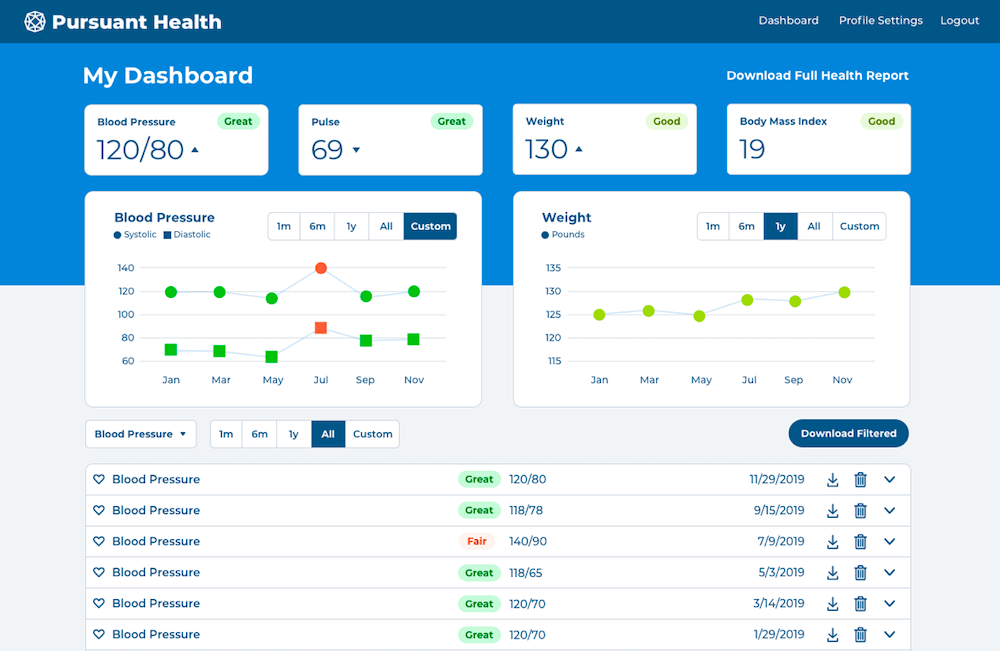
Final Designs
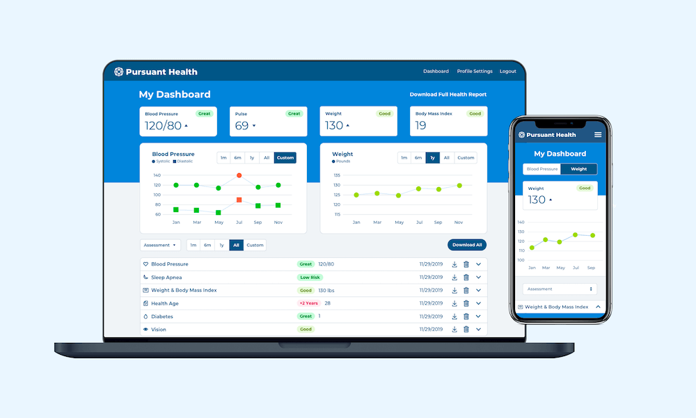
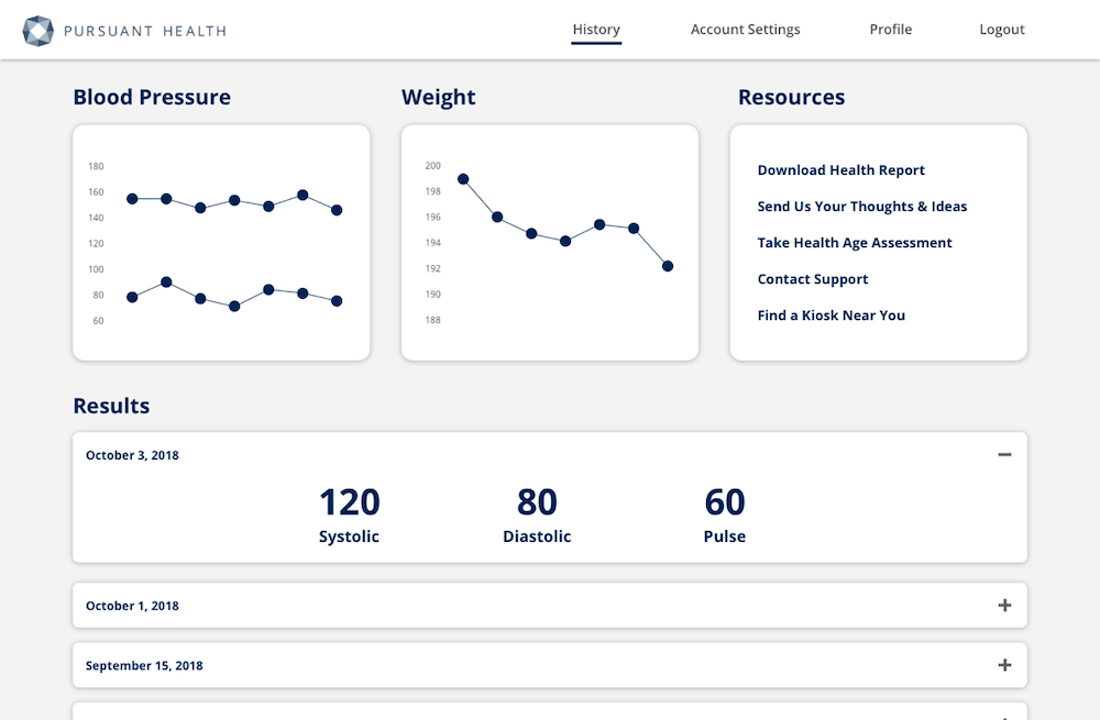
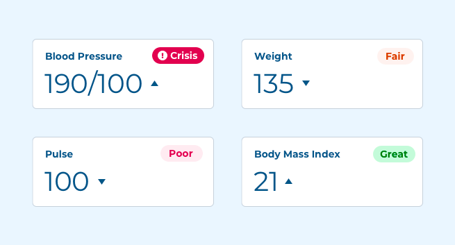
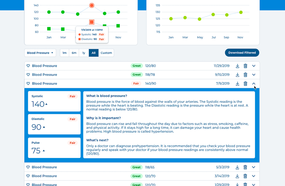
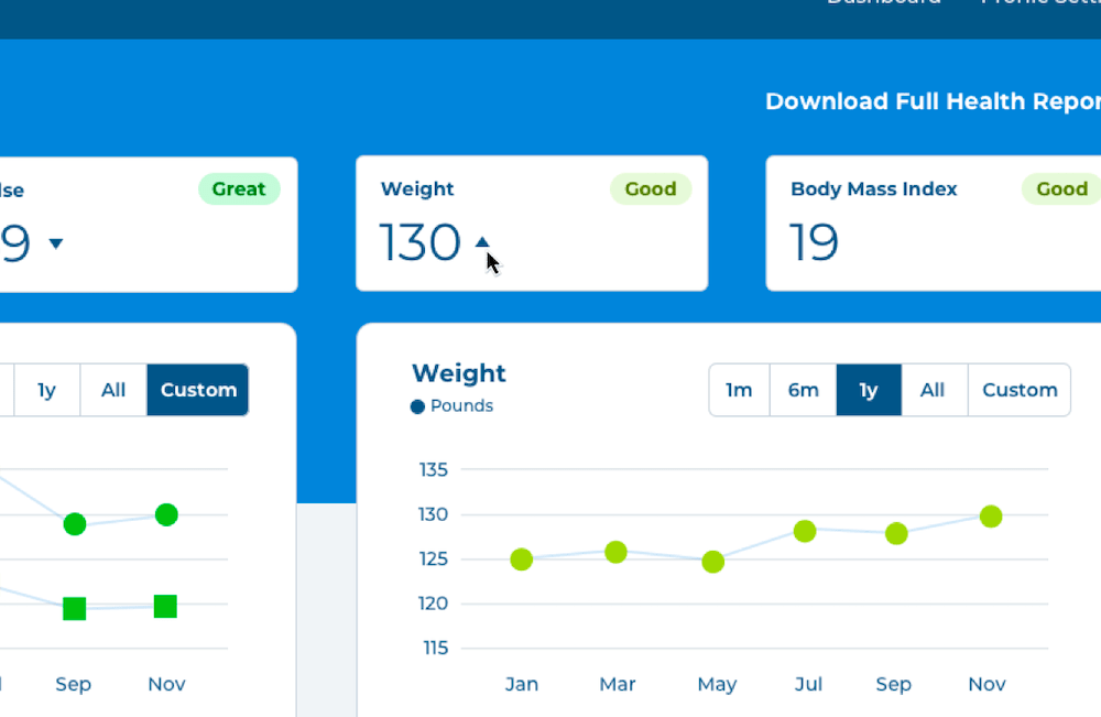
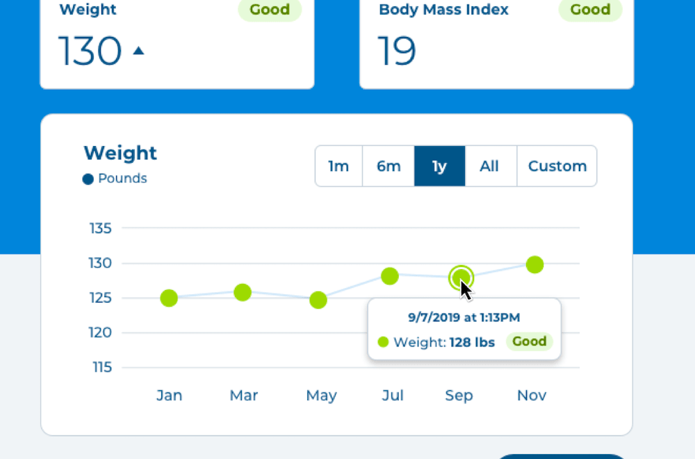
The final dashboard features an easy to consume visual hierarchy. The most important vitals are right at the top, with their rating and value available at a glance.
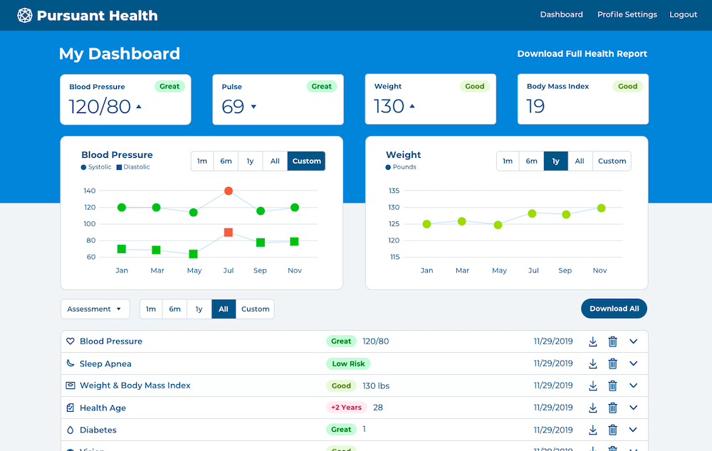
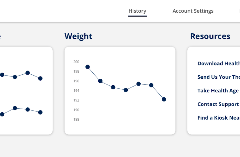
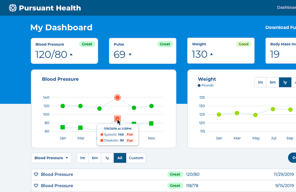
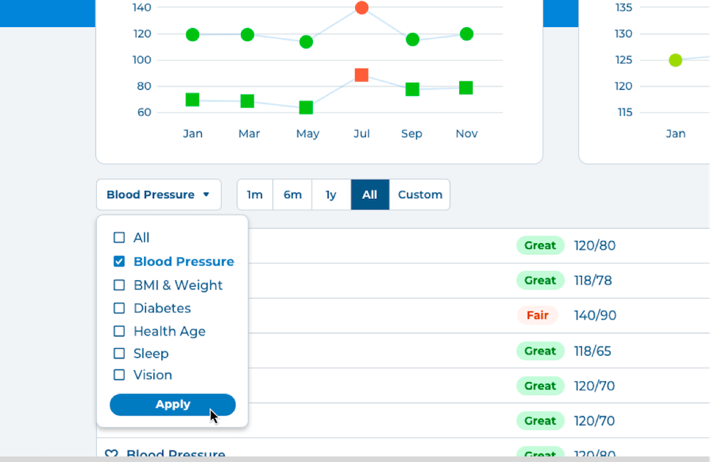
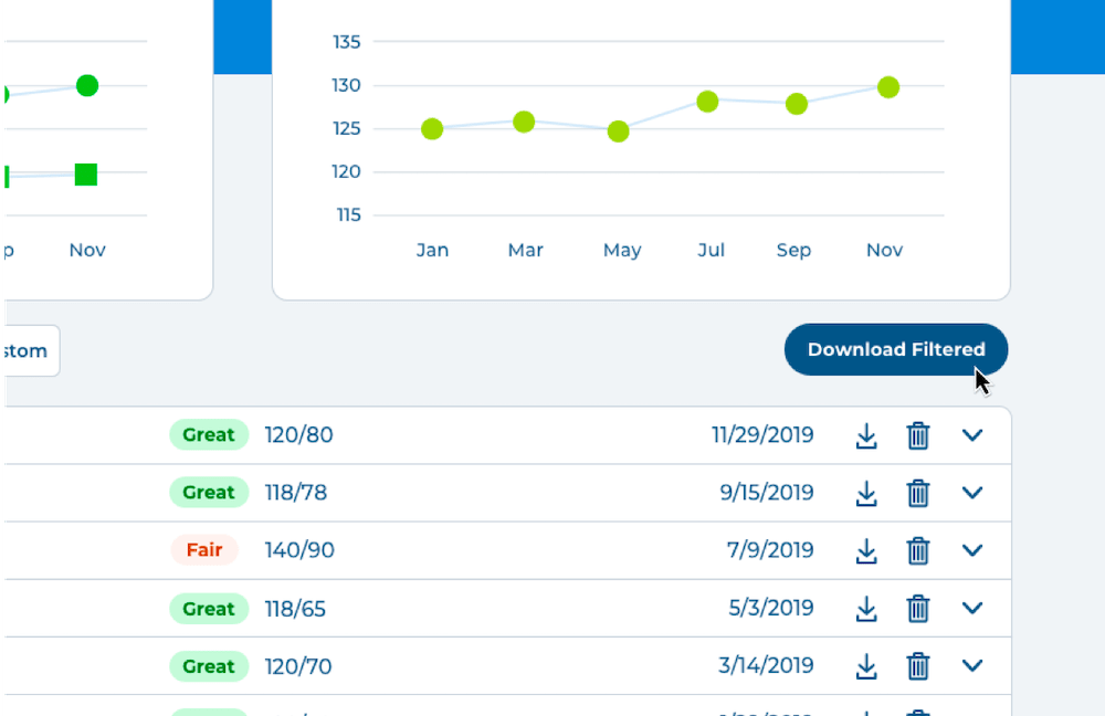
Moving down, the graphs cleanly articulate the blood pressure and weight trends. The circle and square points allow low vision users to distinguish between measurements. Visitors can filter by 3 months, 6 months, 1 year, all, or input a custom date range. Hovering over any point delivers more context, like date, time, value, and rating.
All assessment results are organized into an easy-to-read table. Icons and brightly colored ratings make skimming possible. Each row is expandable on click to reveal more detailed results, like definitions, next steps, and more.
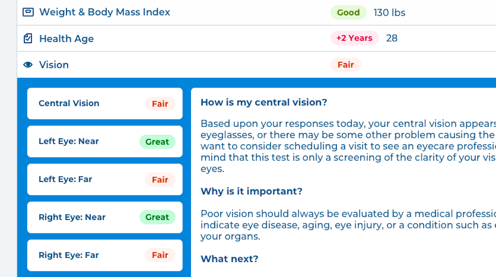
The adaptability of the measurement card is most noticeable in the vision results. These results don’t have a numerical value, but by shortening the card, it remains visually consistent with results that do have a numerical value, without introducing a new card structure. The measurement cards are also friendly to colorblind users by using text, in addition to color, to indicate if a vital’s rating.
Visitors can choose to download an individual result, all results, or use the filter to narrow the results down by assessment type and date.
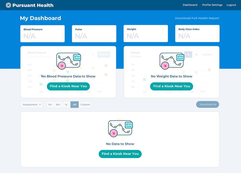
Users with no results are prompted to find a kiosk and start accumulating measurements.
Here's a final task analysis to show how each process has improved. Not only are actions quicker to perform, they're more intuitive - while not alienating users who are familiar with the current site. We can end this increment one step closer to the needs of real users.
1) Filters results by assessment and date
2) Downloads results
3) Shares readable result report
1) Sees a spike on graph
2) Hovers for details
3) Expands result card for definitions and recommendations
1) Sees weight as risen since last measurement
2) Views details on the graph
What Now?
With an 8-week design sprint, it's not possible to test and verify every idea. Given another 8 weeks, here's what I'd experiment with:
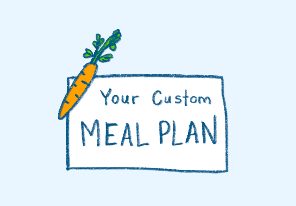
Custom meal and exercise plans and resources based on health measurements
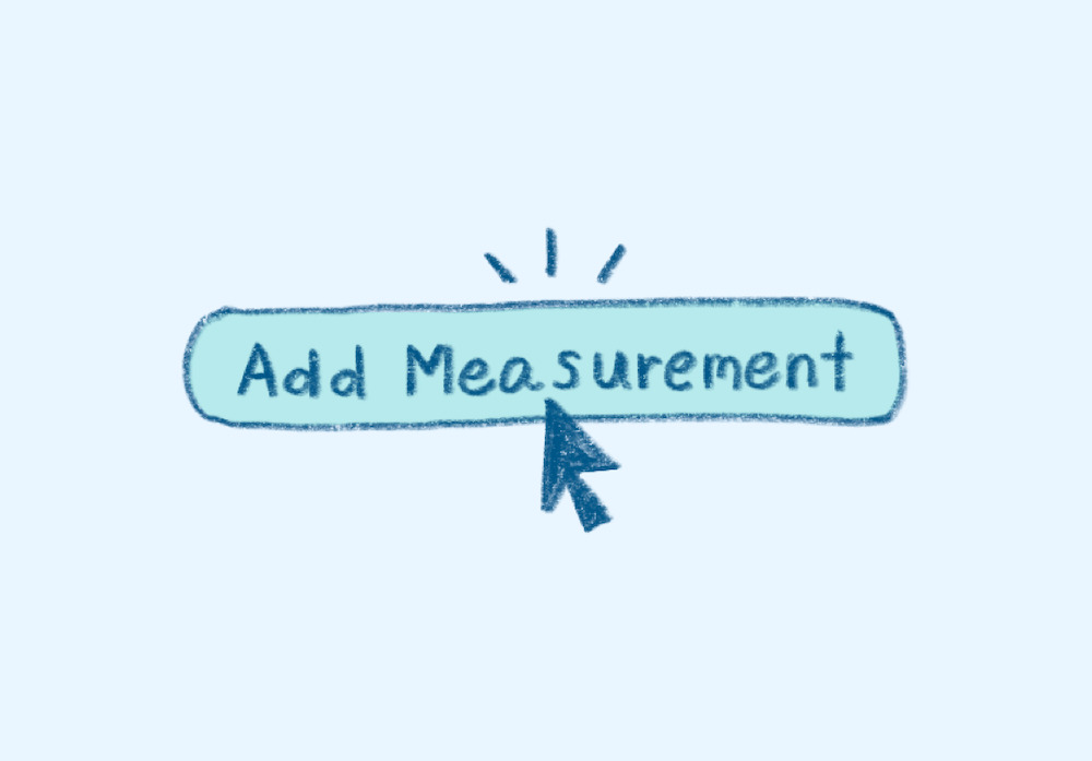
Ability to self-report measurements
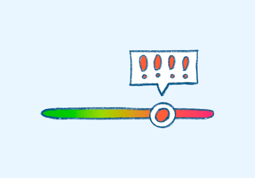
A slider to represent measurement rating
How your measurements rank amongst others in your demographic
Simple graph within each measurement card
Graph segmented by rating