Research | Design | Branding | Accessibility
Developing a Branding and Design System MVP
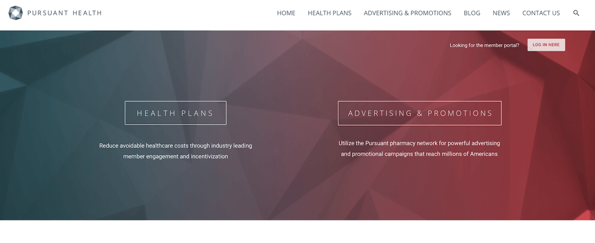
Pursuant Health is a medical start-up created to make health accessible through free health screenings. Pursuant uses population health best practice strategies to empower patients to be in their best health. Located in every Walmart and expanding yearly, 80% of Americans live within 10 miles of one of their medical kiosk.
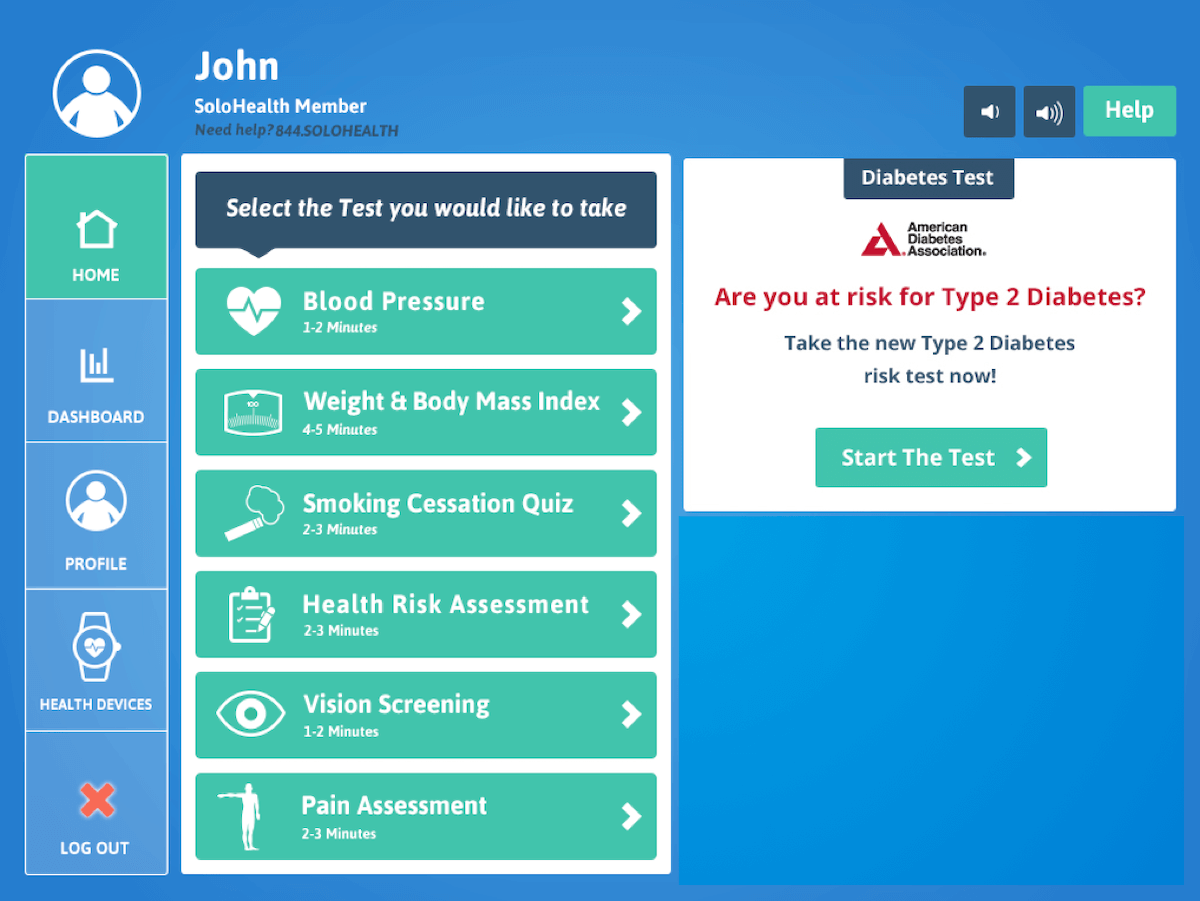
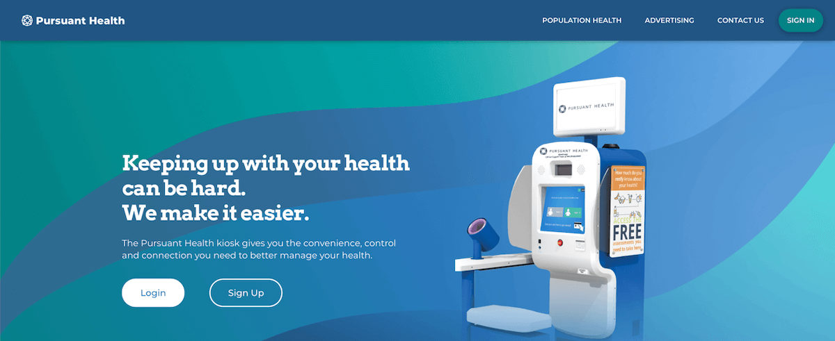
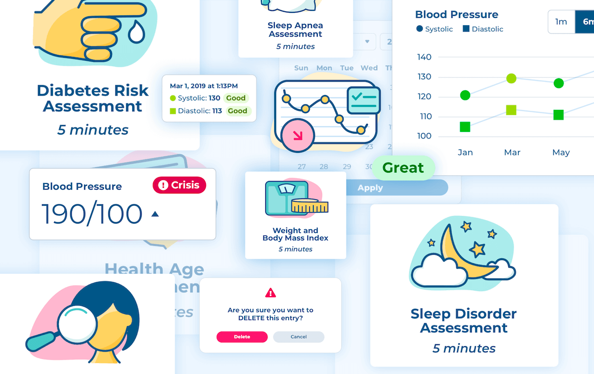
Before I joined, Pursuant Health had started a comprehensive accessibility initiative. The kiosks were upgraded to accommodate wheelchair access; physical buttons were added below the touchscreen; and headphone jacks provided additional privacy for those who rely on a screenreader. Despite this, we were lacking an essential element - an accessible user interface. One look at the UI told me none of the buttons met WCAG color contrast standards.
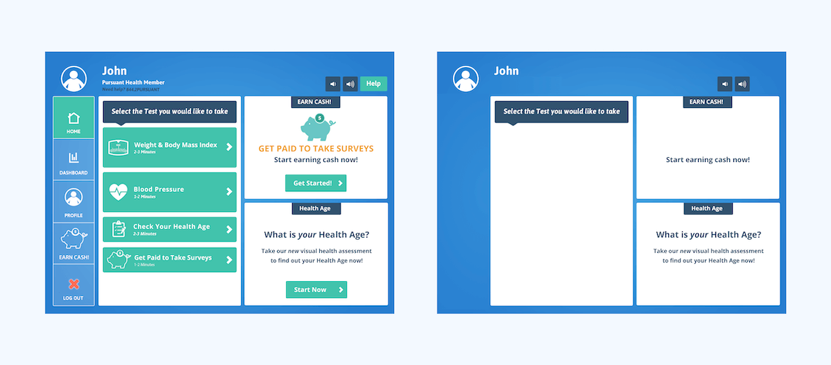
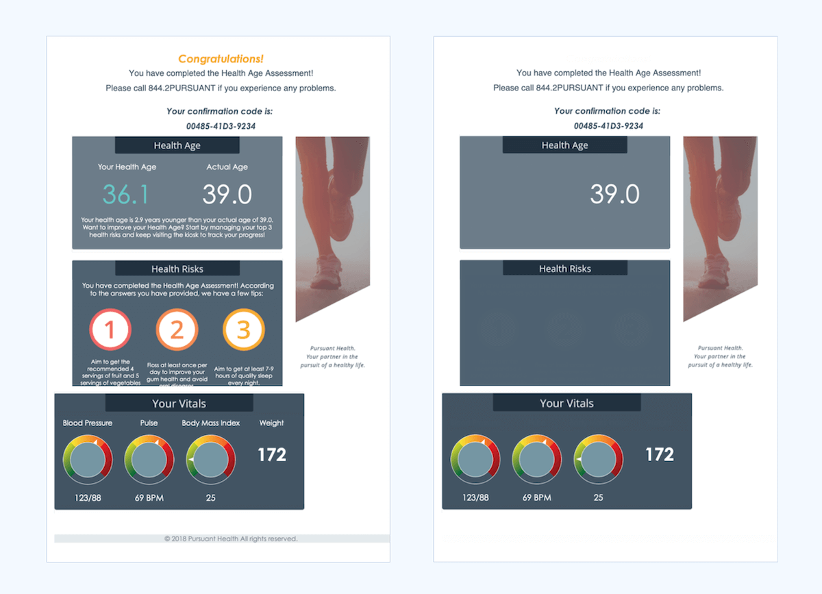
The kiosk homepage and results email with low contrast text removed.
Additionally, user interviews earlier in the quarter revealed that our users found the kiosk dull and
corporate. The Marketing and Advertising teams were pushing for a total redesign.
As for me, the design materials were lacking. My team was transitioning to an agile work schedule,
meaning I needed my design process to be as efficient as possible. Without a defined set of design
components, the other designer and I were making UI decisions on the fly, leading to a lack of
cohesiveness between our designs and each platform. This trickled down to the developers who had to
create brand new styles each development cycle.
We didn't have the time or resources for a full redesign, but we couldn't continue with the current
branding. I chose to invest the end of the next few design increments into building a new design system
MVP.
Goals
After a thorough design audit, I ended up with:
- 🚫 Seven colors, four of which didn't meet contrast guidelines
- 🚫 A collection of buttons used inconsistently
- 🚫 A simple sans-serif
- 🚫 Low contrast and outdated design elements
By the end, I hoped to have:
- ✅ New colors and guidelines on how to use them
- ✅ A library of flexible components suitable for every platform
- ✅ An updated typography guide with serif and sans-serif options
- ✅ A new look and feel that better reflects our brand identity
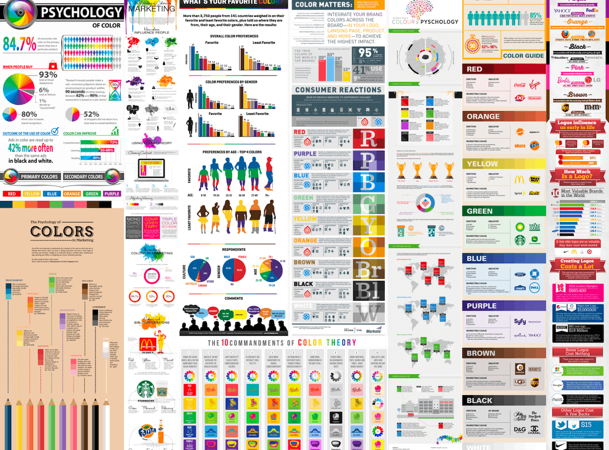
Crowdsourced Color Palette
With no time or budget for market research of our own, I turned to the plethora of public color theory research available online for palette inspiration. I had a few focus words from Marketing on how they wanted the company to be perceived. I compiled as many color and branding statistics as possible.
Using this crowdsourced research, I presented four potential personas to the company, each visually representing a different public image. Framing the different palettes as personas allowed me to quickly communicate the research in a way that was easy to understand for every member of the business, whether they had branding experience or not. I made sure to reserve one persona for our current company branding, as a baseline.
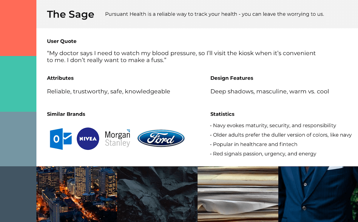
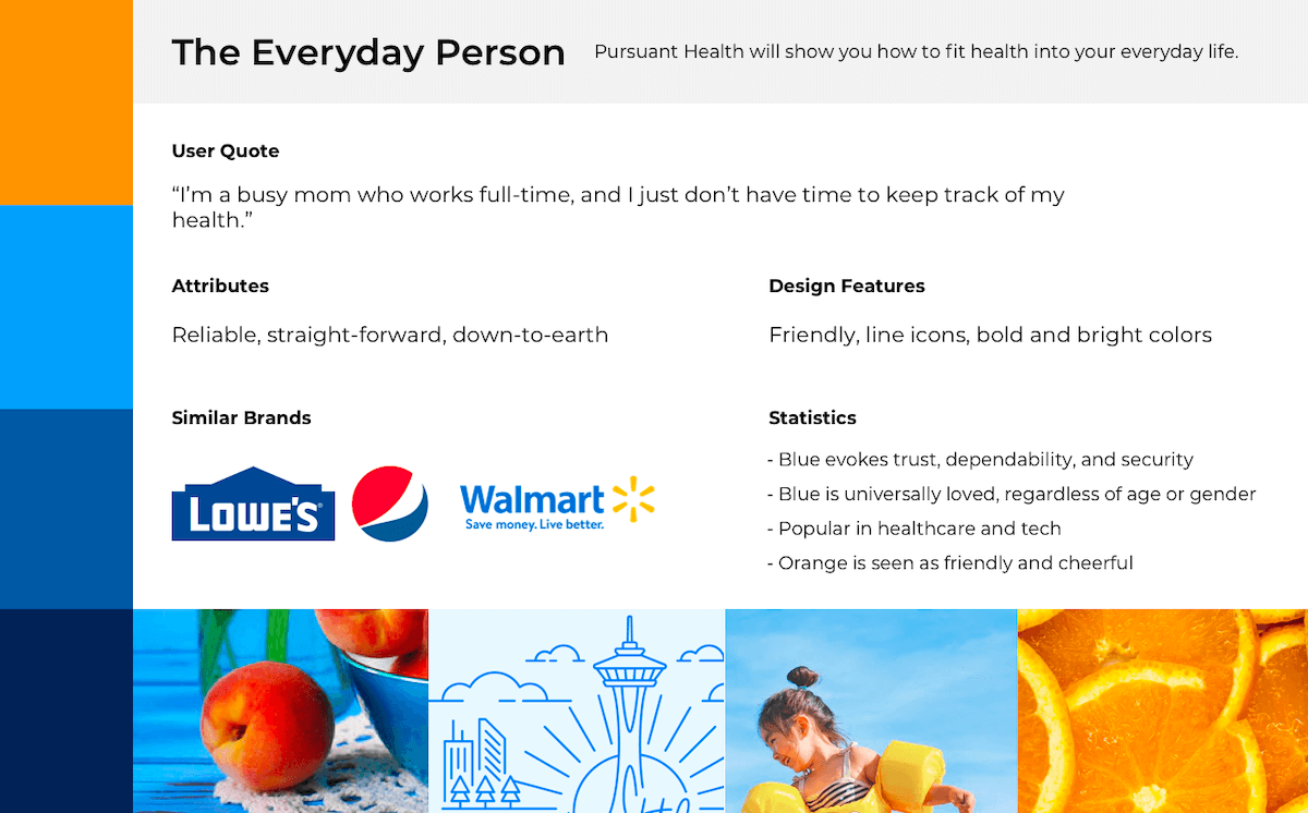
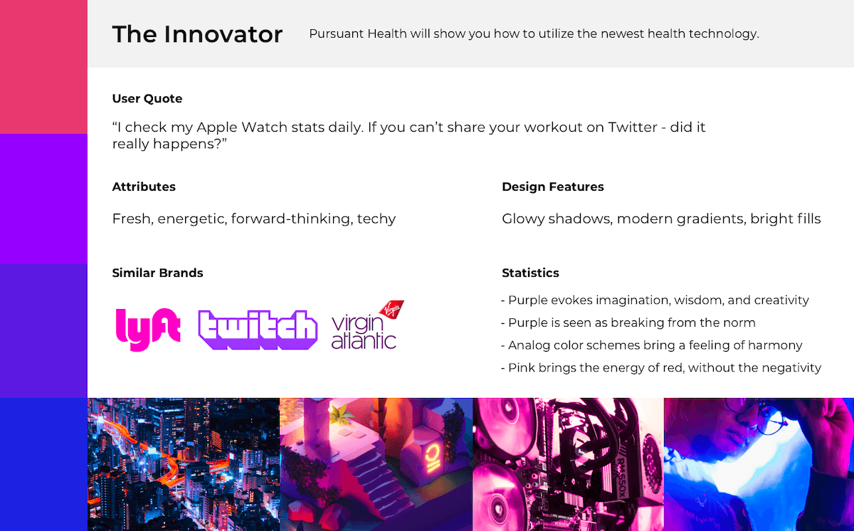
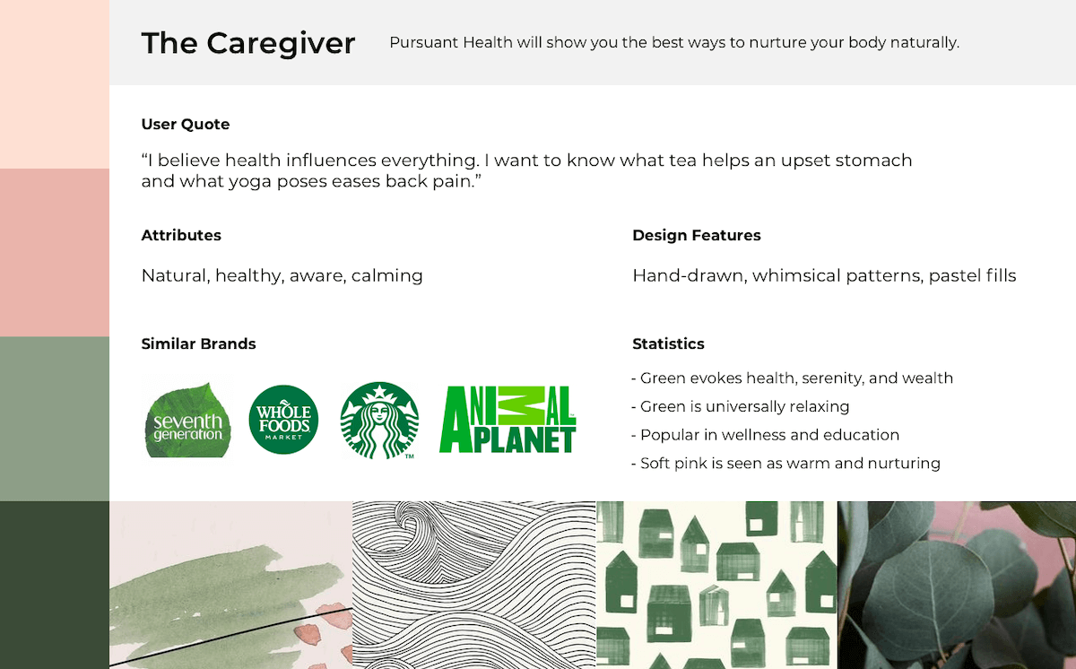
The results were unanimous - we were a mixture of the Innovator and the Everyday Person. We have the energy of the Innovator with the down-to-Earth familiarity of the Everyday Person. With these combined, we found our new palette.
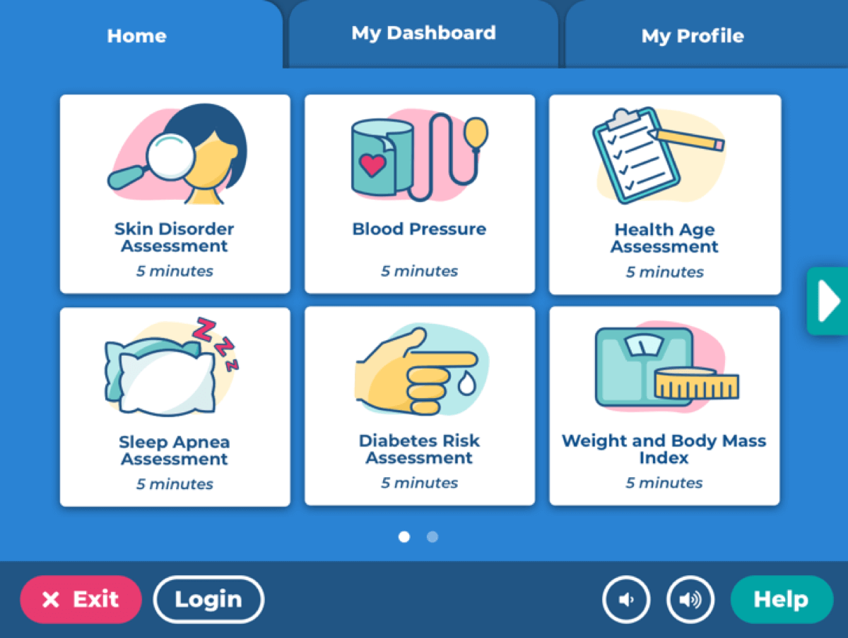
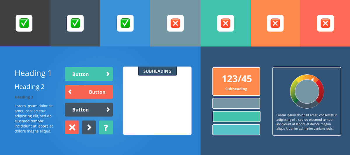
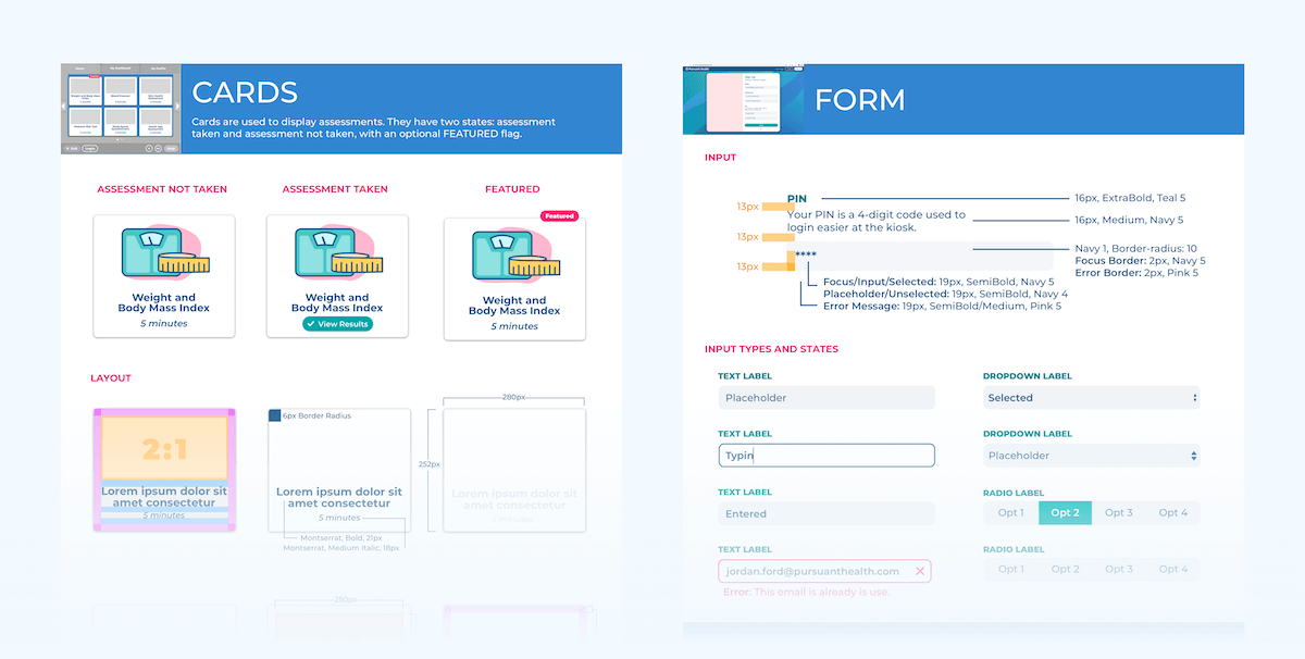
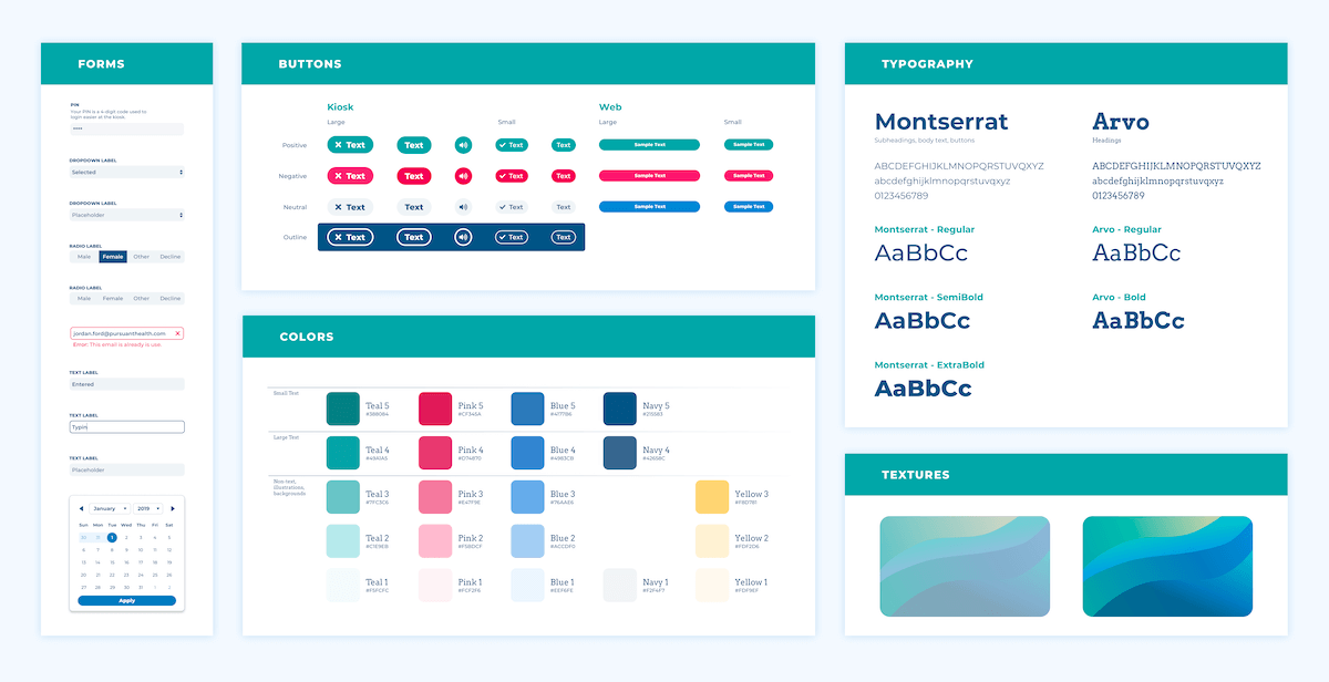
Developing a Catalog of Components
Taking inspiration from our mood boards, I developed a catalog of mobile-first components, including buttons, cards, icons, and typography options. To encourage adoption, I added example CSS for each element.
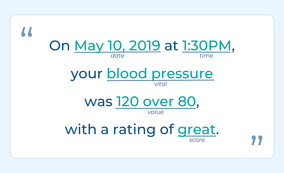
Accessibility Considerations
Throughout our accessibility initiative, we worked closely with Tech for All, a firm that offers accessibility mentoring and testing. While develiping the new design system, they recommended we revamp our text-to-speech script to be more user-focused. I partnered with our Engineering Lead to develop a fill-in-the-blank-style script for each new component and layout.
Our Bigger, Bolder Branding
Familiar enough to be recognized, but different enough to be refreshing, I like to refer to the new
branding as the younger sibling of our previous branding.
User testing showed an immediate enthusiam from users, with quotes like, "It's bigger. It's bolder. It's
eye-catching."
After an adjustment period, development and design have hit a rhythm. Brand new screns don't have to
equal from-scratch components, and every new component joins the design system.
Marketing has gained more independence. With clearly defined use cases for each element, new marketing
materials are as easy as dragging and dropping.