Research | Design | Accessibility
Redesigning Our Kiosk Through User Research and Validation
Pursuant Health is a medical start-up created to make health accessible through free health screenings. Pursuant uses population health best practice strategies to empower patients to be in their best health. Located in every Walmart and expanding yearly, 80% of Americans live within 10 miles of one of their medical kiosk.
Learning About Our Users
Pursuant Health designs and manufactures health kiosks that are stationed in every Walmart store. These kiosks are used by millions of Americans every month to check their blood pressure, take a health assessment, and complete insurance activities. When I was assigned to the project, the experience hadn’t been updated in years, and the business was ready to devote resources to a complete overhaul. Having never used a health kiosk myself, I wanted to know what our users thought of the current design. I needed to establish who was using the kiosk, what pain points they were encountering, and what opportunities we had to improve. The quickest way to do this was through usability testing.
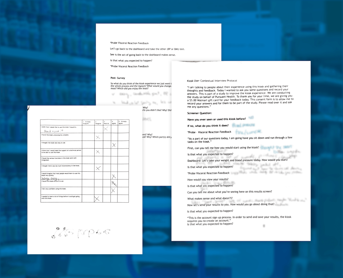
I spent several days visiting kiosks and watching customers use our machines. I recorded these
interviews, parsed the results using an affinity diagram, and refined and organized the main themes into
a user journey map.
With any diagram like this, I like to make a large physical version to hang by my desk. It’s an easy
reference during the design process, and it sparks conversations with non designers that visit my desk.
User experience design can seem a bit mysterious to those unfamiliar with the process, so I love being
able to answer design and research questions with a huge visual aid at the ready.
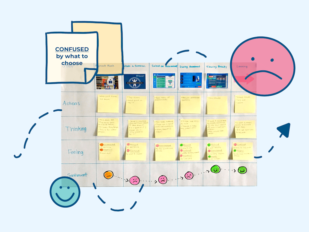
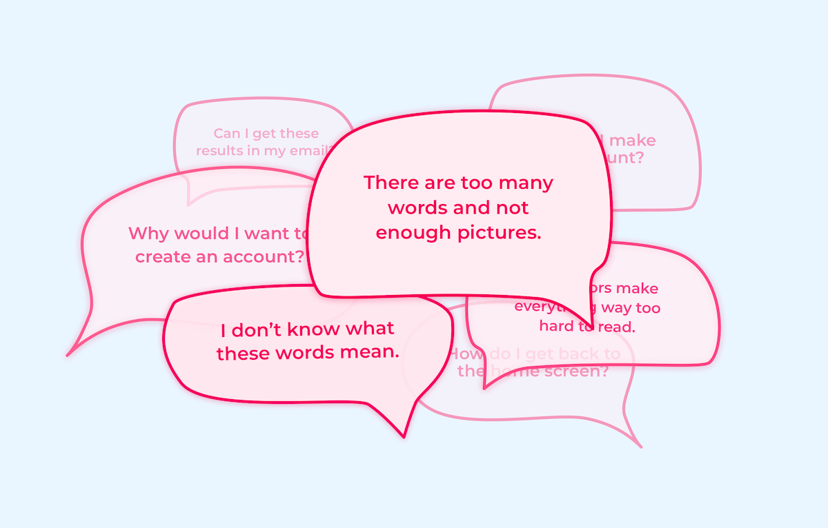
Our users were annoyed, confused, and overwhelmed. From the moment a user sat down at the kiosk, they were overwhelmed by choice, particularly on the home page, dashboard, and results. They didn't see the benefit of an account and found the design muted, corporate, and difficult to read.
Defining Goals
For this increment, I decided to focus on the first things a user sees when operating the kiosk: the homepage and dashboard.
From the user feedback and business goals, I defined four main opportunities for improvement:
- Make it easier for a user to create an account
- Declutter and simplify the home screen
- Trim the dashboard down to results people actually want to see
- Improve accessibility
Sketching It Out
Designing for kiosks presents a unique challenge, and finding inspiration for kiosk design is
surprisingly difficult. While my
background in iOS was most useful during this project, the two aren’t synonymous. Kiosks are
designed for spur-of-the-moment, potentially one-off sessions. Choices should be limited, and onboarding
should be nonexistent.
Because of this, the experience must be dead-simple with as many standardized elements as possible. With
goals in hand, I sketched out several wireframes and paired them down to a few lo-fi designs.
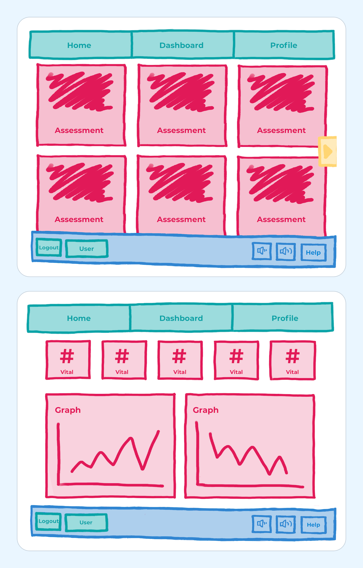
Introduces tabs and focuses on actions. Friendliest to new users.
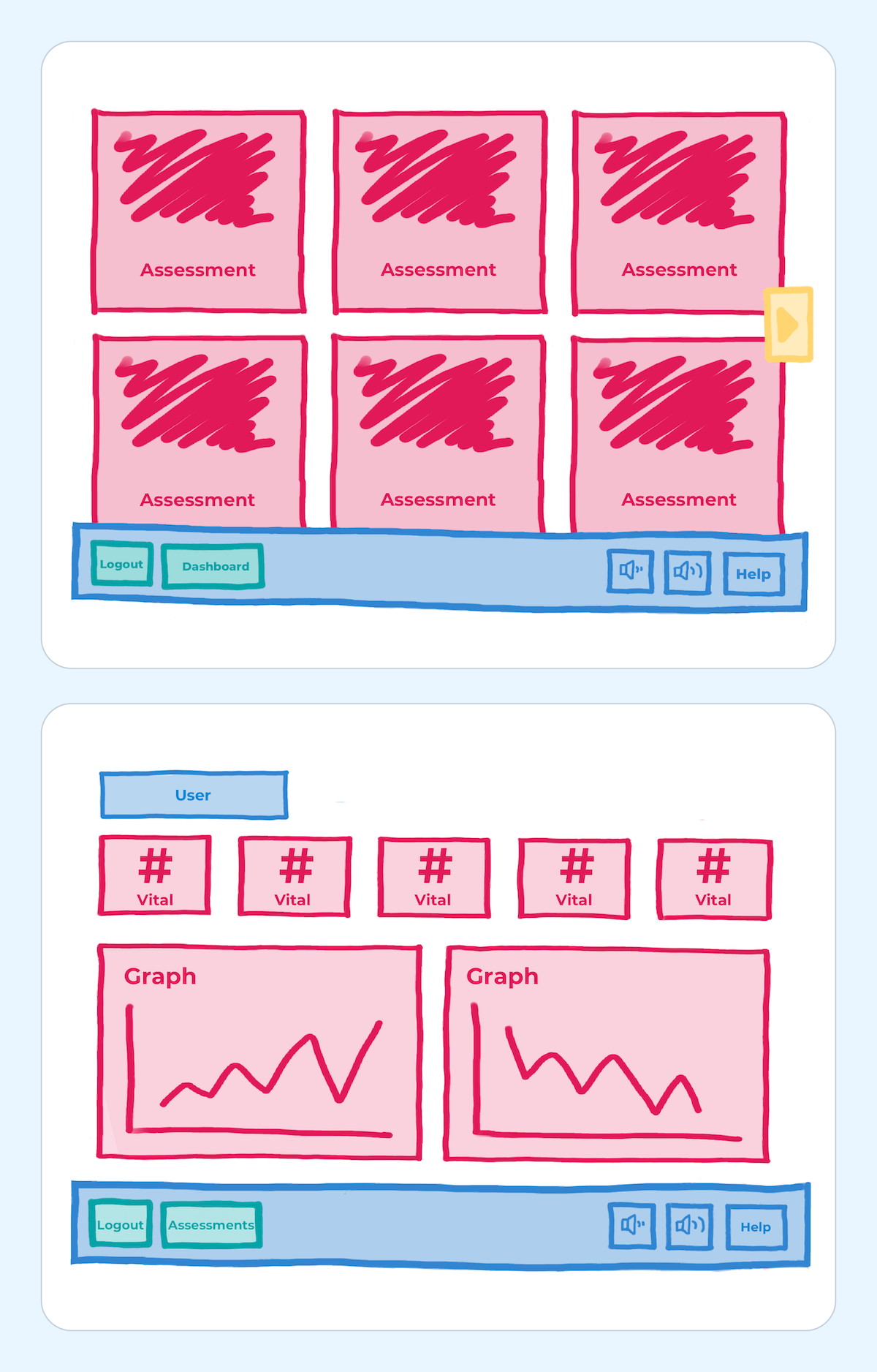
Focuses on assessments and eliminates profile editing on the kiosk.
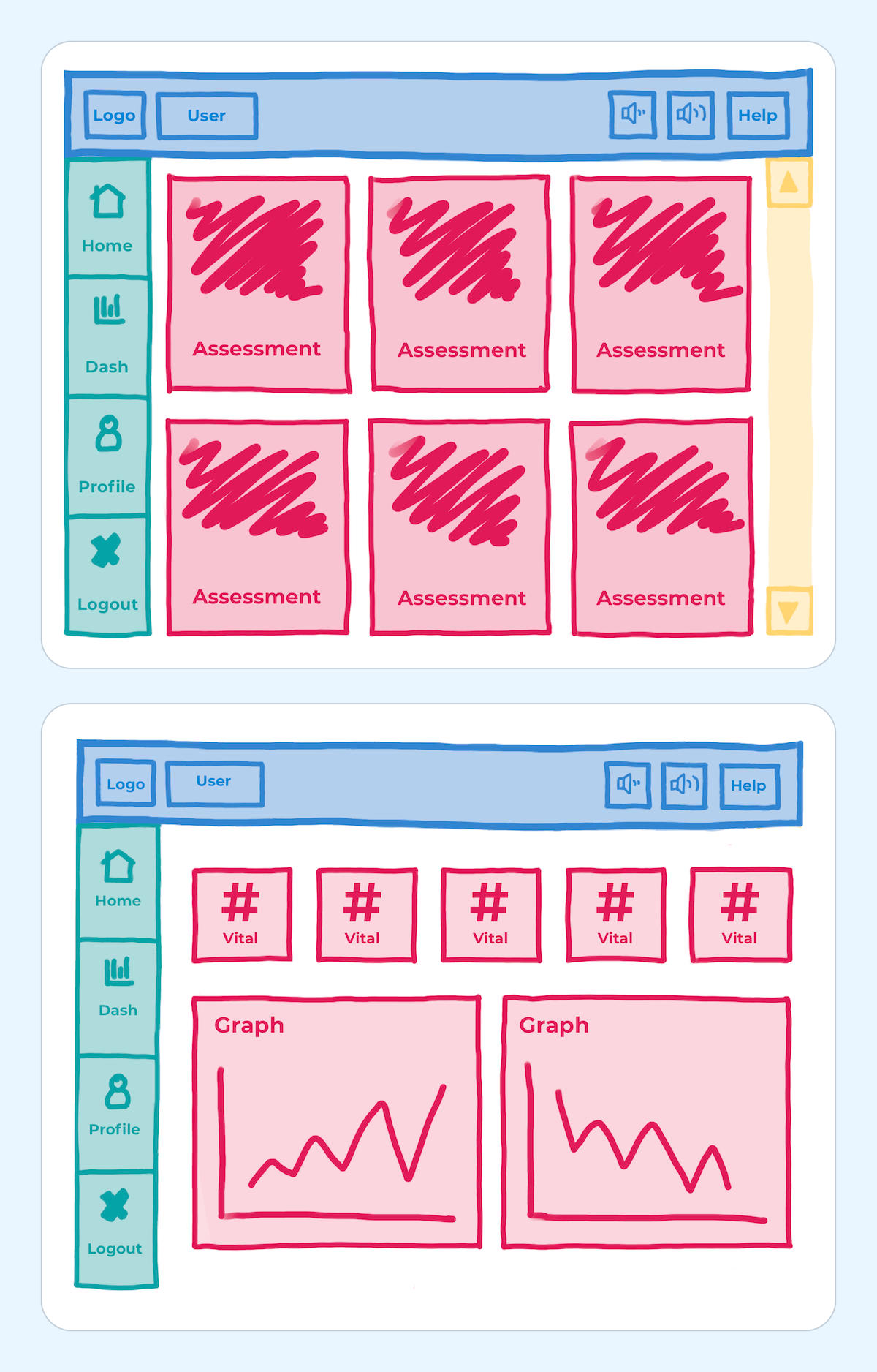
Maintains current features while simplifying UI.
After shopping these around the company, I narrowed in on one design and fleshed it out with our current branding.
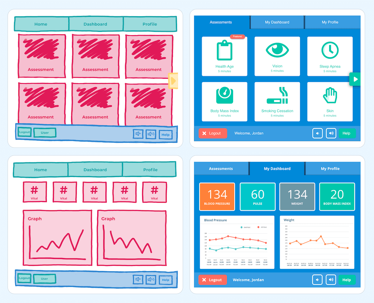
I returned to nearby Walmarts, prototype in hand, and tested out the new design. The response was overwhelmingly positive.
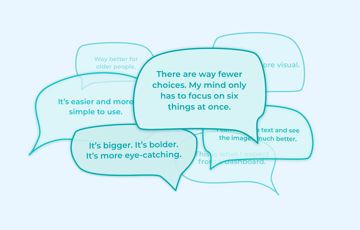
My favorite quote from the interview process was, “There are so many fewer choices. My mind only has to
focus on 6 things.” The old design and the improved design actually have the same number of
choices. Organization is everything.
I also tested heading names for each screen on the kiosk. This one was surprising; I expected users to
prefer more descriptive titles like “assessments” and “results,” but they preferred “home” and
“dashboard.”
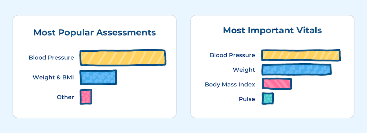
The last bit of testing was a kiosk-wide survey. I wanted to know what vitals users cared about, so at
the end of each blood pressure assessment, users were prompted to rank the importance and relevance of
each result they received.
How the New Design Meets Our Goals
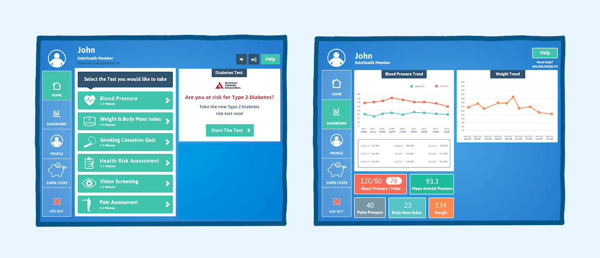
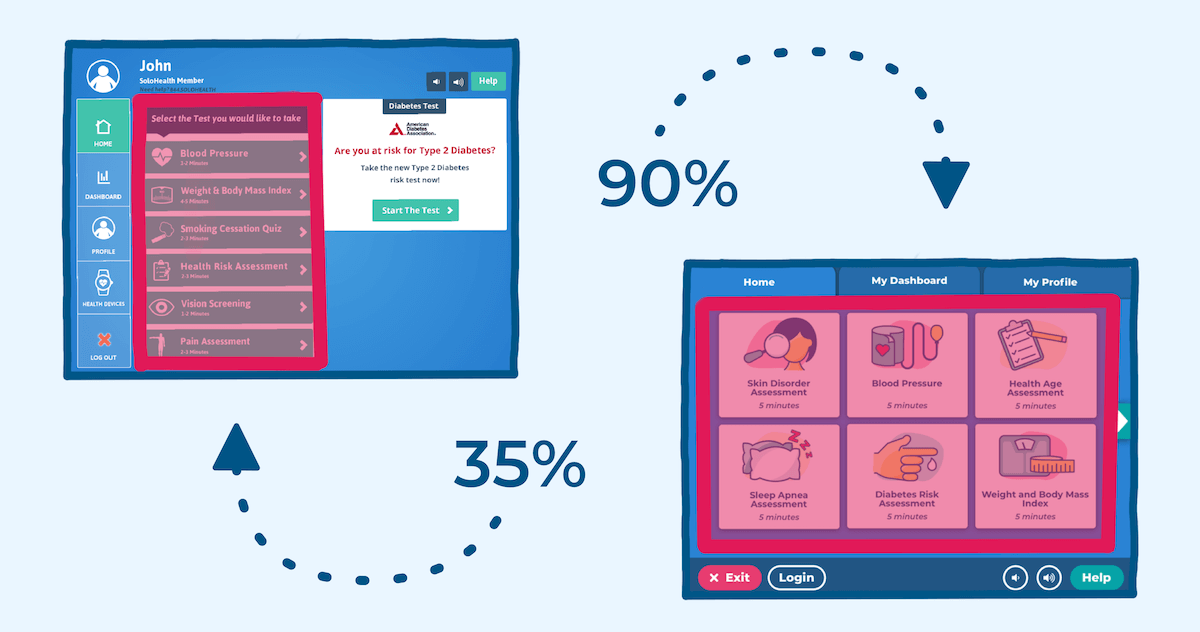
1. Declutter and Simplify the Home Screen
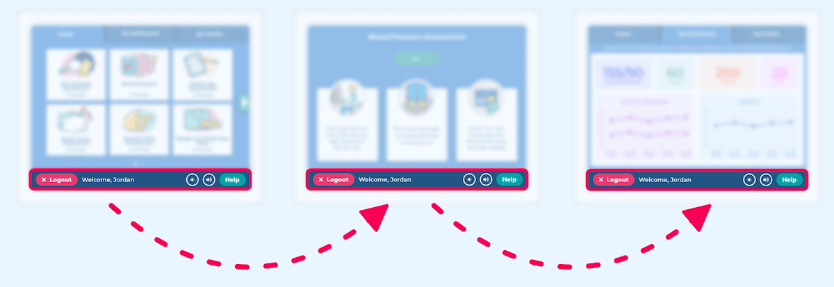
With the current design, the menu and action bar jumped around the screen.
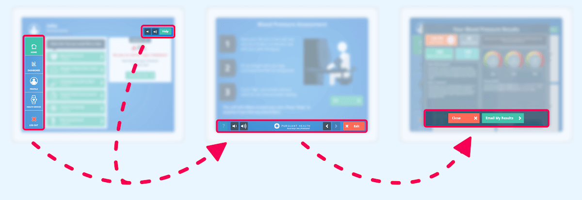
With each page, I anchored the menu and standardized the action bar across the experience.
With the original design, our assessments (why our users sat down at the kiosk in the first place) only represented about 30% of the window. I increased this to 90% and gave each assessment an eye-catching illustration.
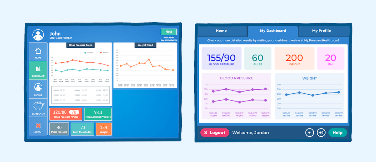
2. Trim the dashboard down to results people actually want to see
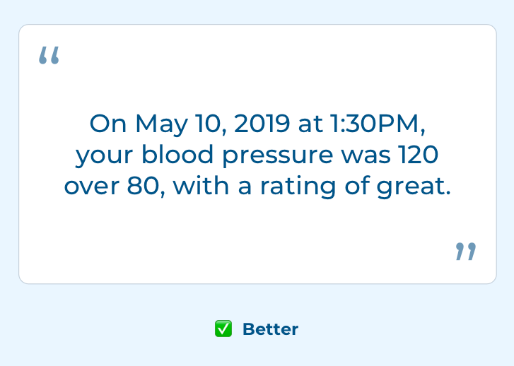
The results of the kiosk-wide survey revealed that our users really only cared about a few measurements: blood pressure, pulse, weight, and BMI. By limiting the dashboard to these results, I was able to make the design more meaningful and increase the graph size, making it easier to read.
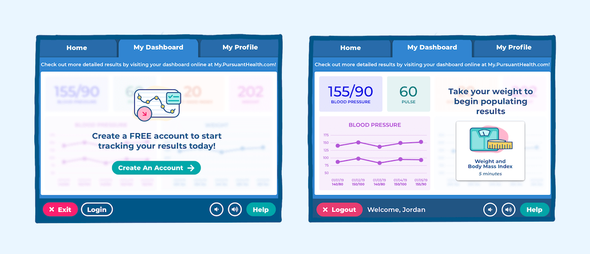
3. Make it easier for a user to create an account
In the old design, users couldn’t actually create or login to an account from the home screen or
dashboard. I improved this by adding calls-to-action in logical areas throughout the experience. For
example, the dashboard icon was previously greyed out for guest users.
Now, users can preview their dashboard and create an account right from this screen. Don’t have results
yet? You can jump right in to an assessment from your dashboard and start populating results
immediately.
4. Improve accessibility
In parallel with the experience redesign, I started working on updated branding. Our current branding wasn’t meeting contrast ratios and didn’t test well with users. They found the colors muted and corporate. I worked with our marketing department to define our business direction and created some sample business personas and mood boards, validated by user research. You can learn more about that in my Branding and Design System Case Study. With our branding up to code, we worked with Tech for All to fill in our accessibility gaps. This included implementing speech-to-text software and writing guide text.
Before: screenreader text is robotic and difficult to understand
After: screenreader text is conversation and contextual