Research | Design | Branding
🎉Top 200 iPad Apps for Business
The Design Update That Doubled Profits on Day One
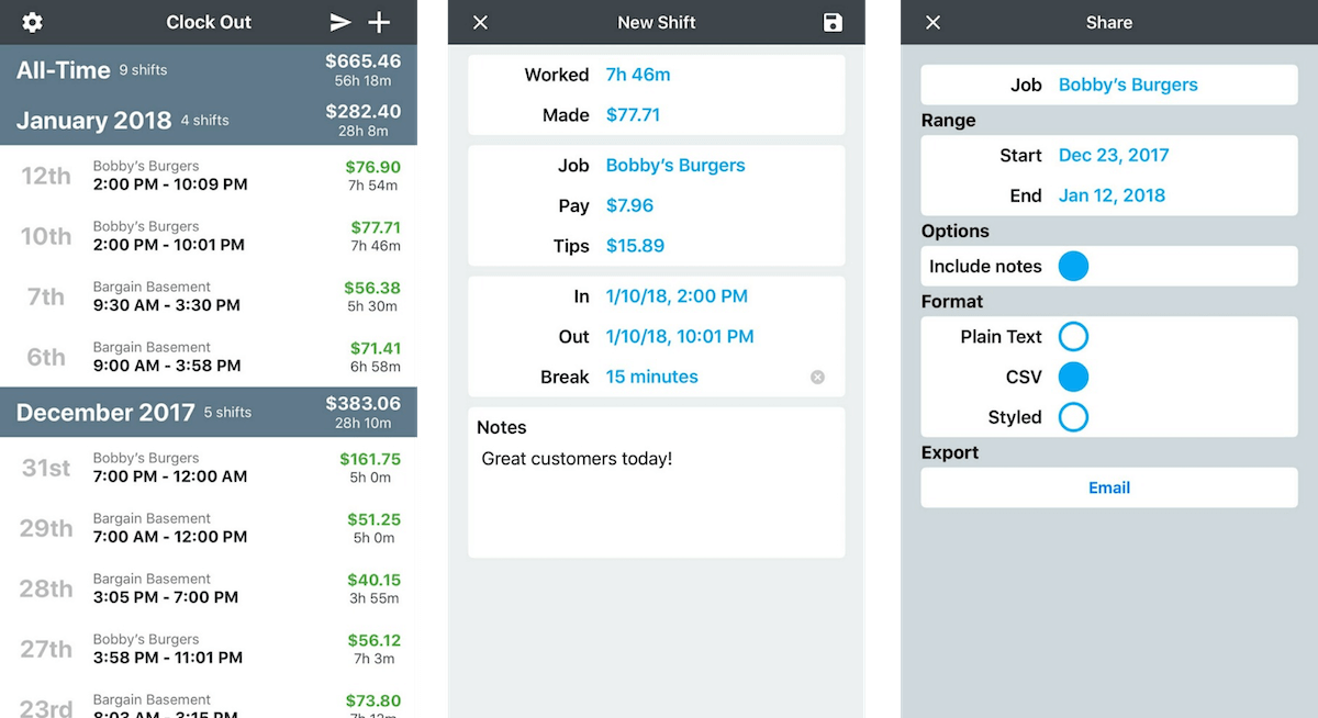
Clock In helps you keep track of your hours, pay, tips, and notes for all of your jobs. You can clock in and see your time and earnings as you work or add shifts after your work. You may quickly export/share a timesheet with any number of shifts in a variety of configurations and formats. Jobs are color coded so that you can clearly see when and where you worked in the calendar. Jobs can also have a pay period which allows you to see pay period by pay period time worked and pay.
TOOLS
Sketch
PLATFORMS
iOS, iPadOS
Clock In started as a simple time tracking app. The user flow was essentially limited to entering a start time, end time, tips, and a break. Users could see the values organized in a table.
Users loved the simplicity, but it came at the expense of basic features. Growth had come to plateau, and once I started exploring the app, I knew a complete overhaul was necessary. But first, I needed to answer a few questions:
- Who is using our app?
- Why are users choosing us over our competitors? (Conversely, why are others choosing our competitors over us?)
- What features would be most valuable to our users?
- What features should we add first?
The last two questions were distinct; the Clock In team consists of me and one developer, the original
creator of the app. It was important to us to complete the redesign in small, agile increments. That way
we can test our solutions along the way, getting user feedback with each release.
I used three sources for my data.
- User reviews
- User Survey
- Competitive Analysis
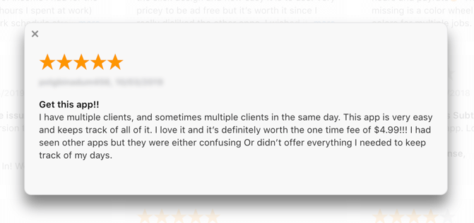
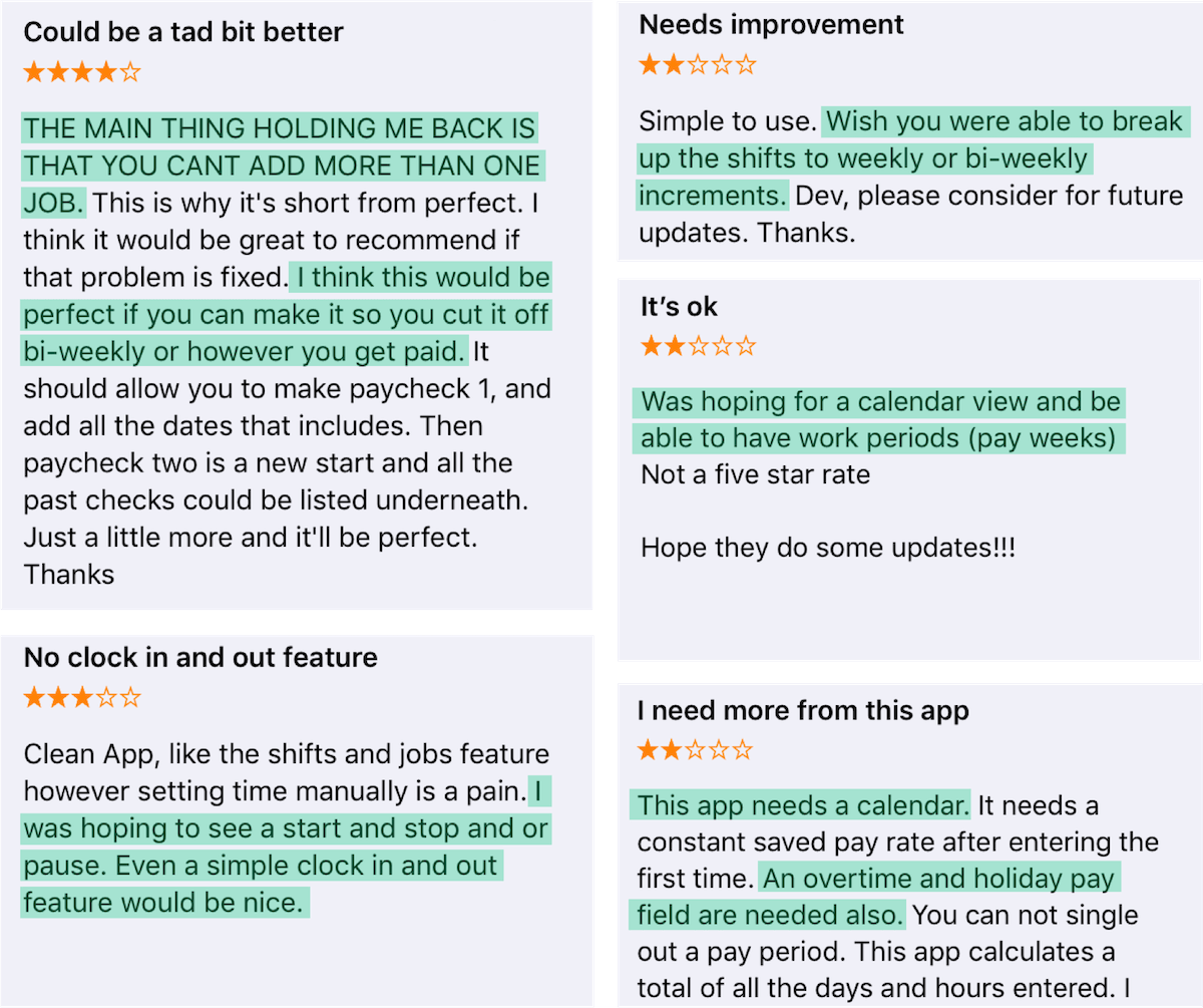
User Reviews
I began sifting through user reviews and isolating issues they had with the app. Certain features came up again and again.
User Survey
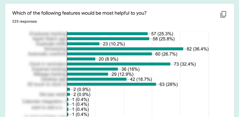
Although the reviews were fairly consistent, I wanted to quantify these statements with a user survey. I ran a survey using Google Surveys from within the app. It’s always surprising to me how many users are willing to volunteer their time to improve the app. The survey was a mix of demographic questions and feature request questions. I wanted to see how these employees were using the app and what type of jobs they worked. Did the average user have one job or ten jobs? Were they paid weekly, monthly, or something in between?
Competitive Analysis
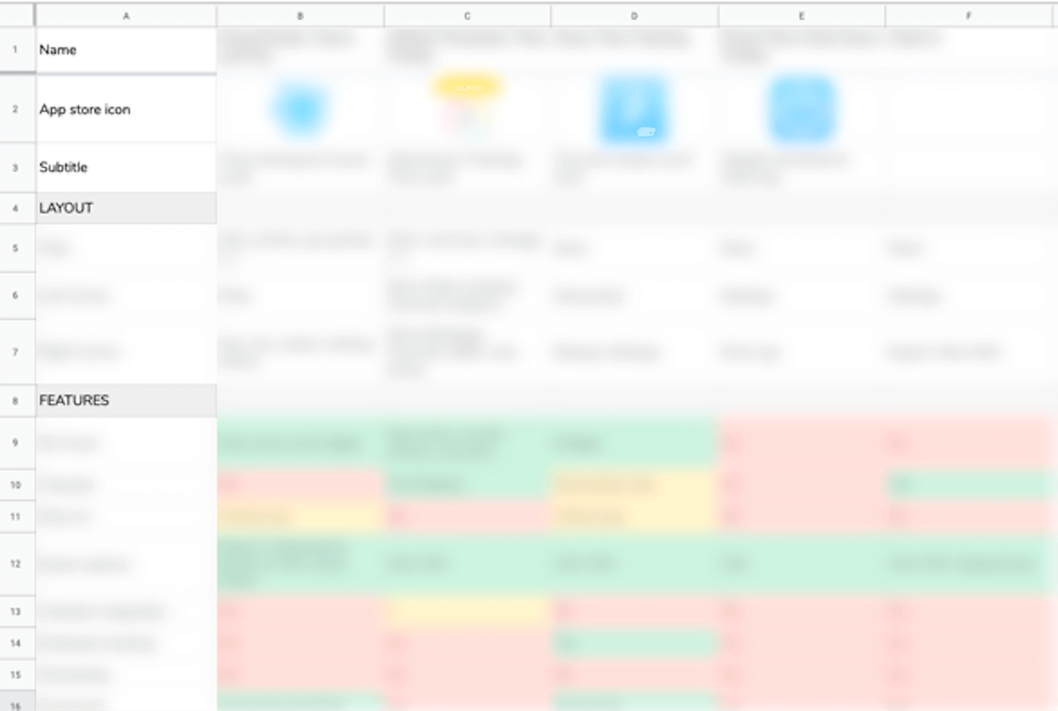
While awaiting our survey results, I compiled data and screenshots from the Apple app store, coupled with download and revenue data from sites such as AppFigures to form a competitive analysis. In navigating each app to tally up their features, I understood what brought so many people to our app - while other apps had double or even triple the features, they were clunky to use. I often got lost looking for a feature, and returning to the shift list took multiple swipes and taps. I knew I had to keep this simplicity going forward.
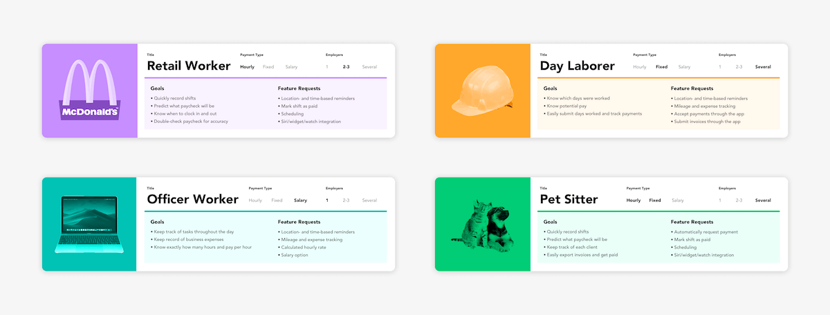
User Personas
With the demographic results from the survey back, I was able to isolate four main user groups, which in turn became personas. Personas are a way to humanize the people you’re designing for. At every step of the redesign process, I was able to ask myself, “Does this work for our day laborer? Can our office worker use this feature?” With so many use cases, I wanted our app to be flexible enough to work for all, yet specific enough that no one is missing key features.
Value:Effort Analysis
Using the feature request list, the developer and I ranked each feature’s effort. Combined with the number of times it was requested, I created a Value:Effort matrix. Features in the green square (top-left) are easy wins; features in the orange squares (top-right and bottom-left) are equal effort and value; features in the red square (bottom-right) are too much effort with not enough value. In general, you want to stay in the top two squares. The bottom left square might seem tempting, but for this project, it would only benefit a small number of users while taking time away from other higher value asks.
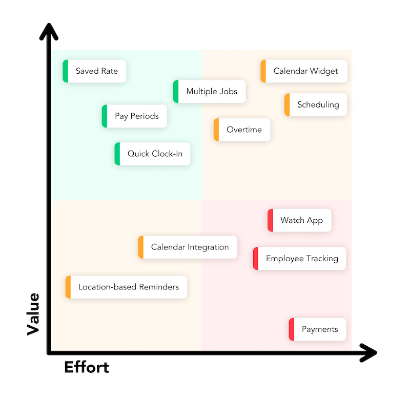
We settled on six features:
- Saved rate
- Pay periods
- Quick clock-in
- Multiple jobs
- Overtime
- Calendar widget
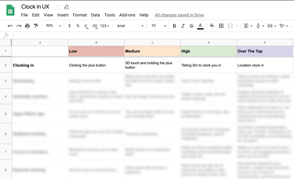
Over the Top Features
For brainstorming, we did a fun thought experiment modeled after Airbnb co-founder Brian Chesky’s 11-star experience activity. I put each feature on a separate row with columns titled Low, Medium, High, and Over the Top. For each feature, we discussed increasingly over the top ways of implementing it. For our app, that meant decreasingly complicated solutions for the user. What if instead of clocking in everyday, we just knew when you were working? What if instead of having to guess a tax rate, we just did your taxes for you - complete with IRS submission? While most of these were out of scope for this increment, we chose a couple Mediums to implement right off the bat.
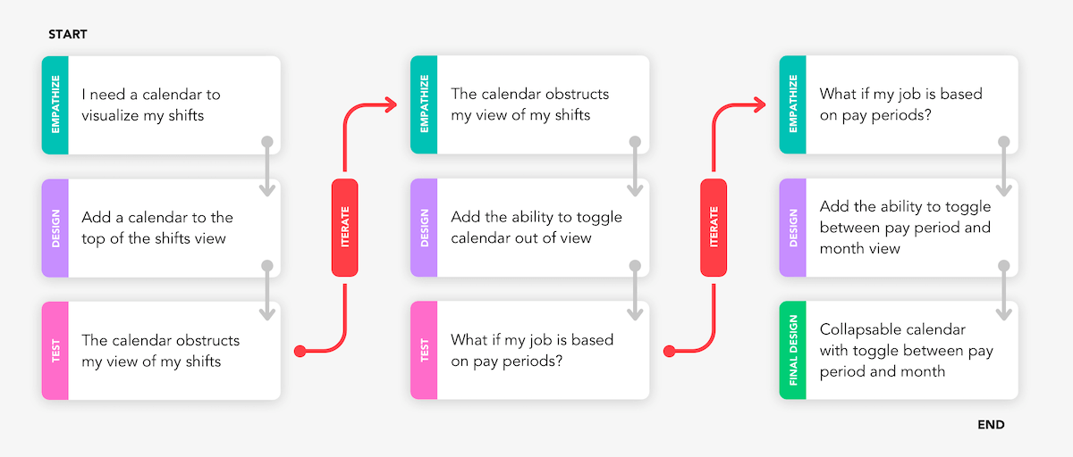
When designing each feature, I references the user personas and conducted small user surveys to iterate on the design in realtime. Here you can see the process of iterating on the Calendar Widget feature.
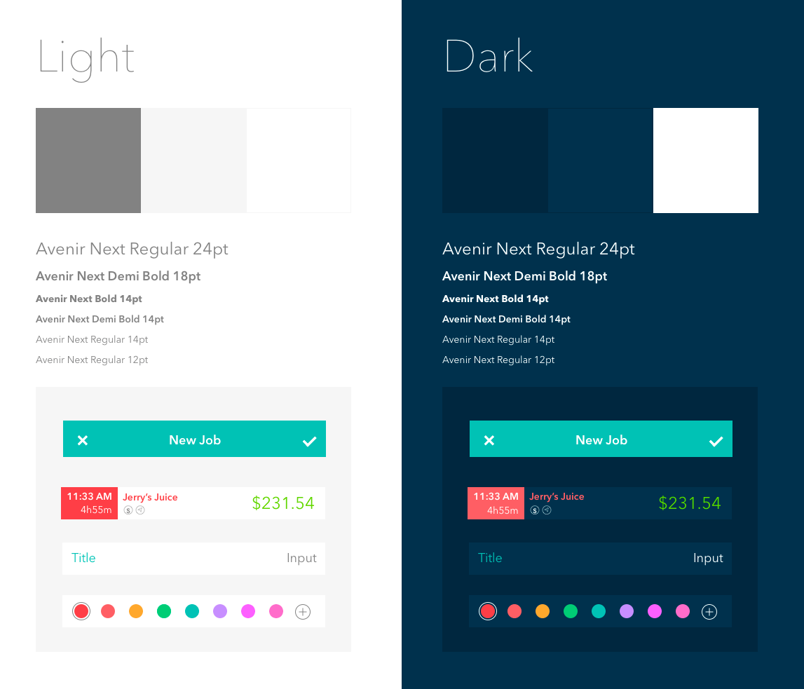
A refreshed and modernized UI completed the redesign.
Final App
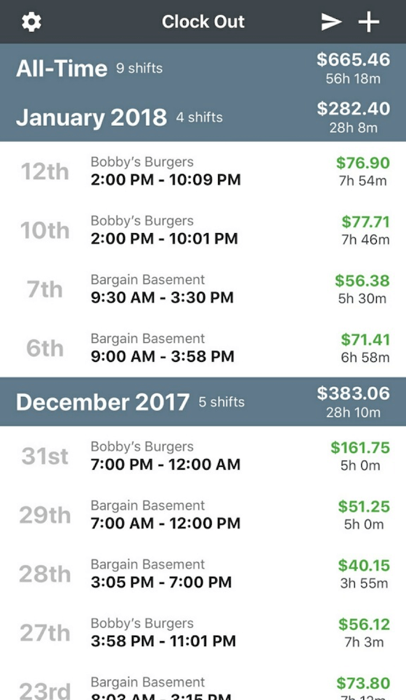
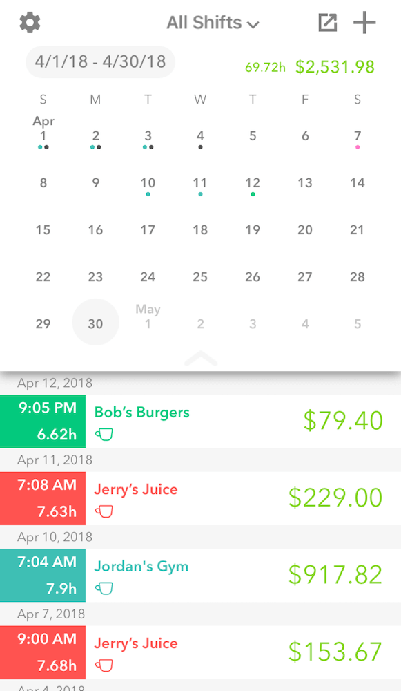
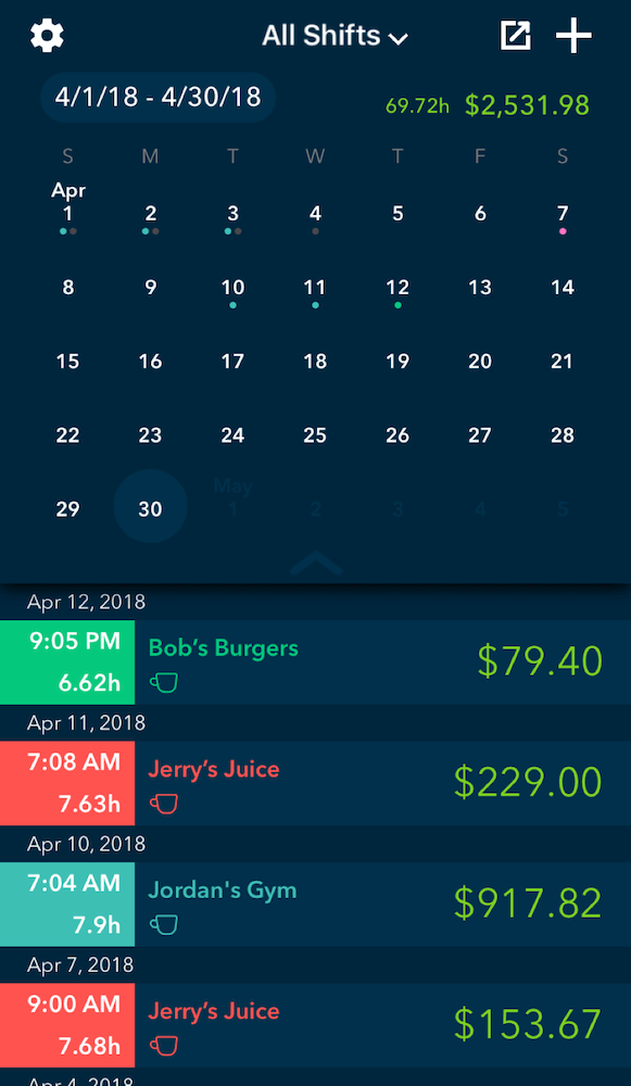
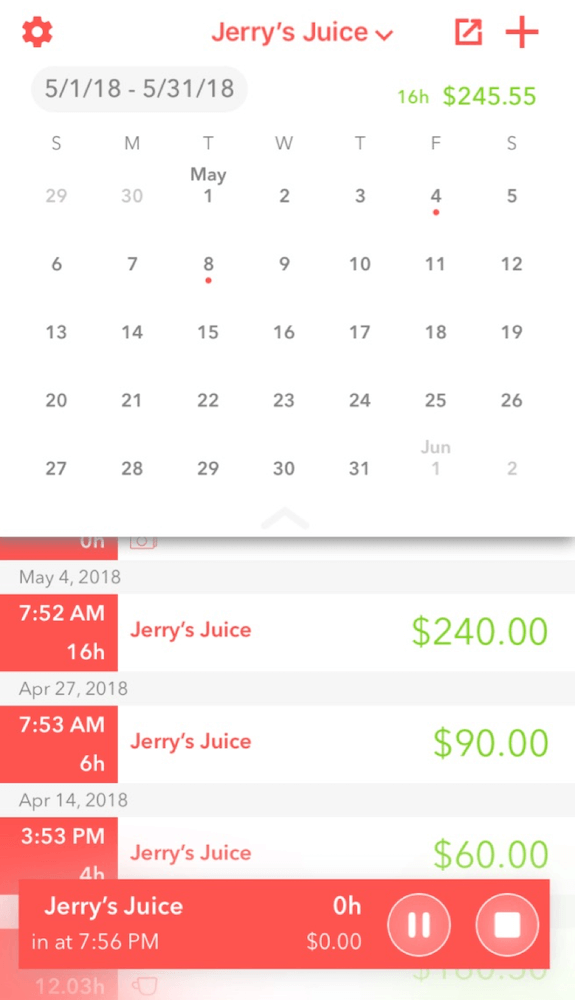
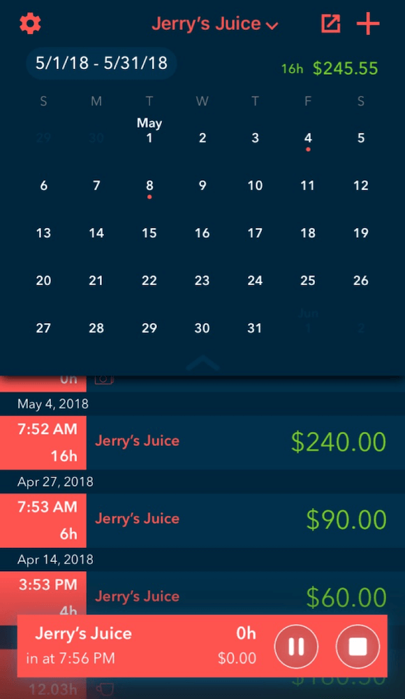
The old shifts screen didn't have a way to visual the days worked. The new shifts screen has added calendar with color-coded shifts.
The calendar is easily dismissed to reveal more shifts.
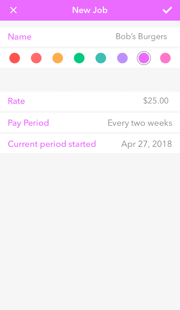
Jobs are easily personalized and color-coded.
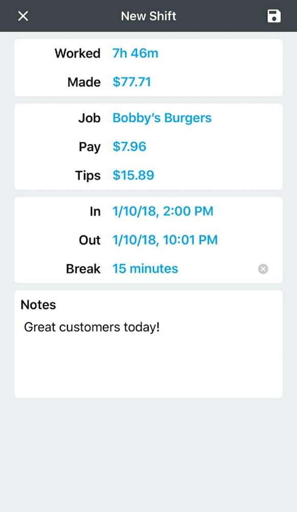
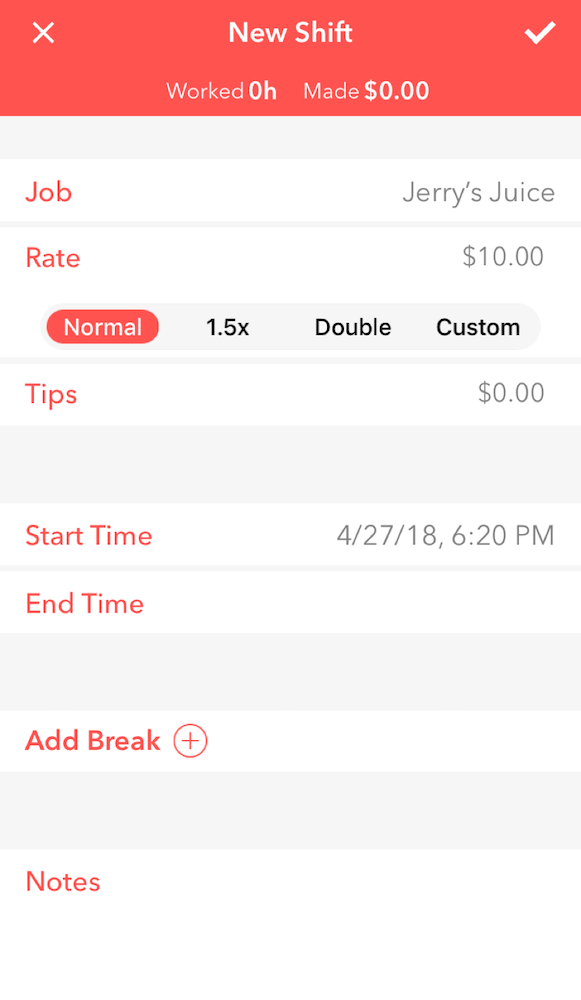
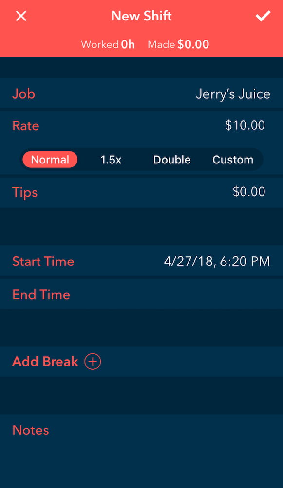
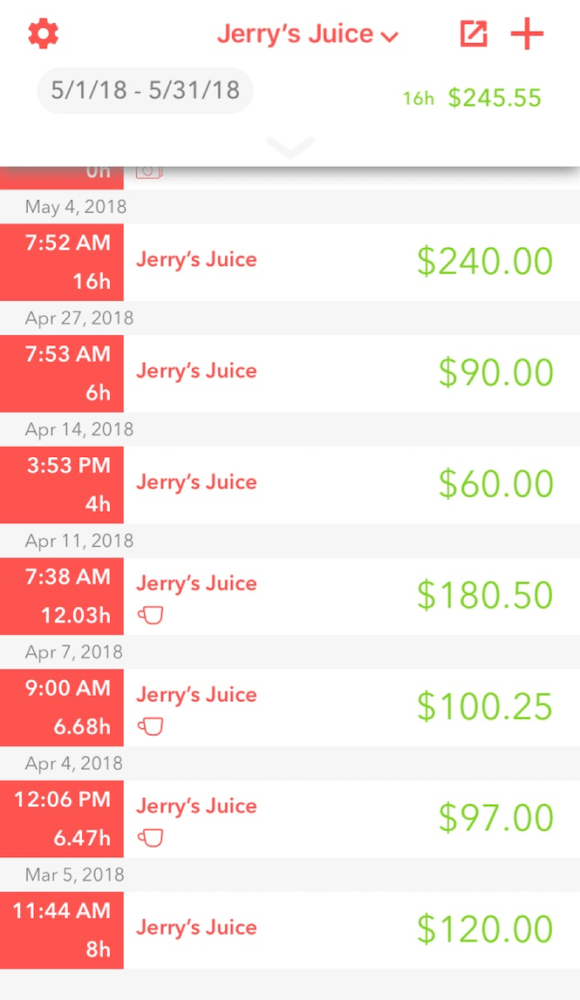
The old shift screen didn't account for holiday pay or time and a half. The new shift screen allows for easier customization of rate and breaks.
Users can now effortlessly clock in with one touch by holding down the add button in the top right corner.
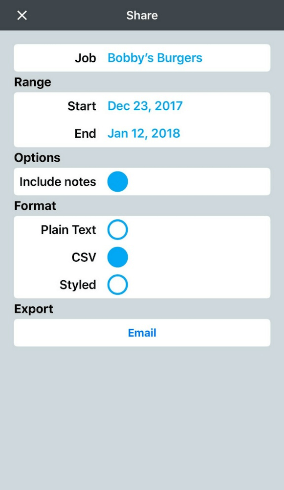
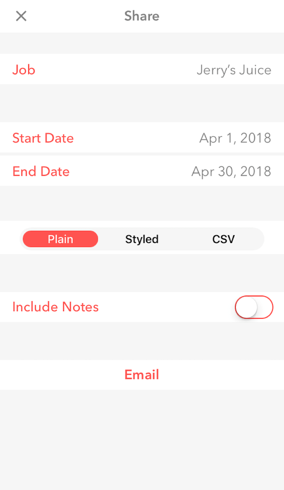
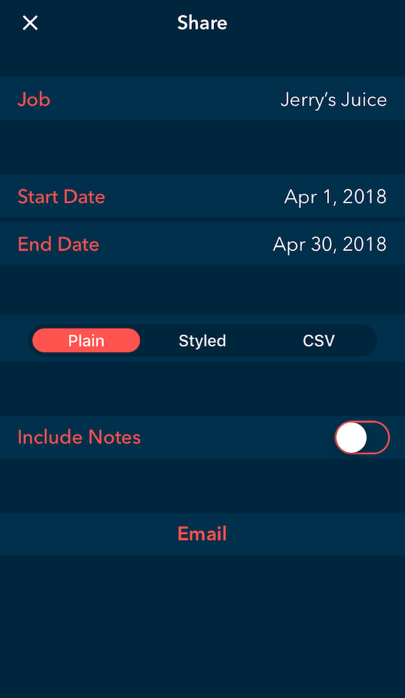
The updated sharing screen reflects the new design.
The result was a feature-heavy update that felt familiar to our legacy users, while gaining a 200% increase in revenue from new users, and a spike in activity landed us in the top 200 business apps for iOS.