Research | Design | Development | Accessibility
Designing and Developing a User-Focused Homepage
Pursuant Health is a medical start-up created to make health accessible through free health screenings. Pursuant uses population health best practice strategies to empower patients to be in their best health. Located in every Walmart and expanding yearly, 80% of Americans live within 10 miles of one of their medical kiosk.
In the process of researching for our soft rebrand, I took a look at what message our marketing site was sending.
It was no surprise users found us corporate and bland. Our outdated site catered only to prospective
advertising or healthcare clients. We were getting daily support tickets from users who couldn't figure
out how to log in to our results
portal and couldn't even tell what we did. Though the kiosk is how most people know us, it didn't
appear anywhere on our homepage. As for performance, the site was taking 10 seconds or more to load,
bogged down with unused plugins and unnecessarily large images. It also wasn't mobile-friendly and
contained more than a couple dead links.
With so many unique pages, a redesign of the entire site would take several months, which was more time
than our marketing team could afford to devote to rewriting copy and polishing strategies. We narrowed
it down to three main goals:
 Research
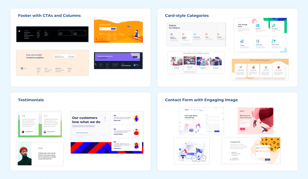
Before sketching, I wanted to see what our peers were doing. I did a quick competitive analysis of similar companies to see how they were reaching customers. I combined screenshots from these companies with inspiration I'd found on Dribbble, Behance, etc etc etc.
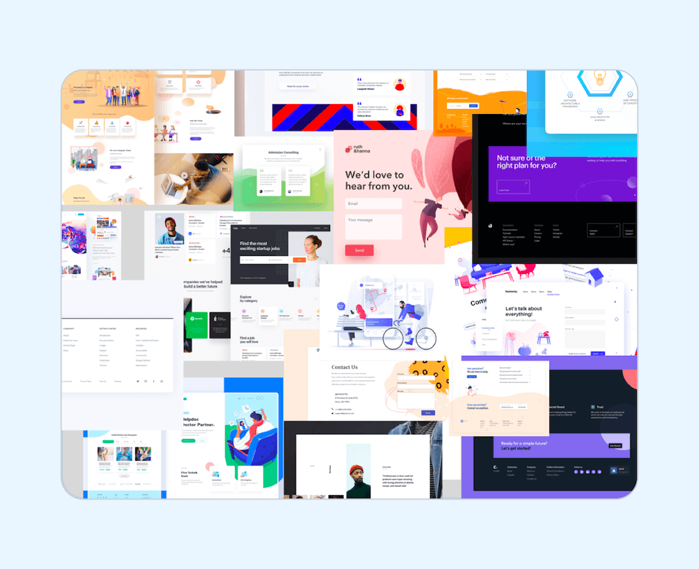
When gathering inspiration, I take notes on what immediately draws me to a design, then I look for patterns and sort the screenshots based on those patterns.
User experience design can seem a bit mysterious to those unfamiliar with the process. Because of this, I always like to include non-designers in as much of the process as possible. For this project, I printed out large screenshots of our site and taped them all around the conference room. I invited our business team in and gave each person a pad of sticky notes and a pen. In 30-seconds intervals, I asked them to write as many responses as possible to each question then hang that sticky note on the corresponding screenshot. I asked questions like, “what sections of our site are unsuccessful? What sections are successful? What’s the first thing you noticed about each screenshot? What’s a site you visited recently that wowed you?” This process was a lot of fun and inspired many interesting conversations.
 Wireframing
I started playing with layouts and how I wanted to introduce our company to those who visit the site.
Using the inspiration and insights from the day before, I patch-worked the screenshots into various
wireframes. As designers, we're used to seeing past the wireframe to the final design. For others, it
can sometimes be difficult to visualize how wireframes will translate to a final product, but there's
not always time to create meticulous hi-fi mock-ups of each potential design. To solve this, I pieced
together examples of the elements I saw in the final design, creating a "medium-fi" wireframe that gets
the idea across without oversimplifying it.
I shared the best of these with the marketing team.
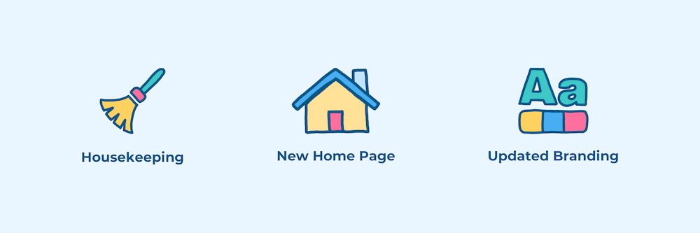
 Housekeeping
While the marketing team looked over the sketches, I got to work on cleaning up the site. Using Pingdom, I was able to isolate what plugins and media files were causing our slow loading times. I removed dead links, updated or replaced old plugins, and optimized all the images. When possible, I pared down old copy and redrew images to match the new branding.
 Implementing
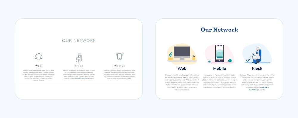
With approval on the sketches from the Marketing team, I moved on to the final design. Using the new
design system, I fleshed out the wireframe with our new branding and started implementing it on the
site.
While we didn't have time to redesign the entire site, I at least wanted to update the stylesheet to
reflect the new branding. Simple tweaks, like adding shadows, rounding corners, and updating HEX codes,
brought continuity to every page.
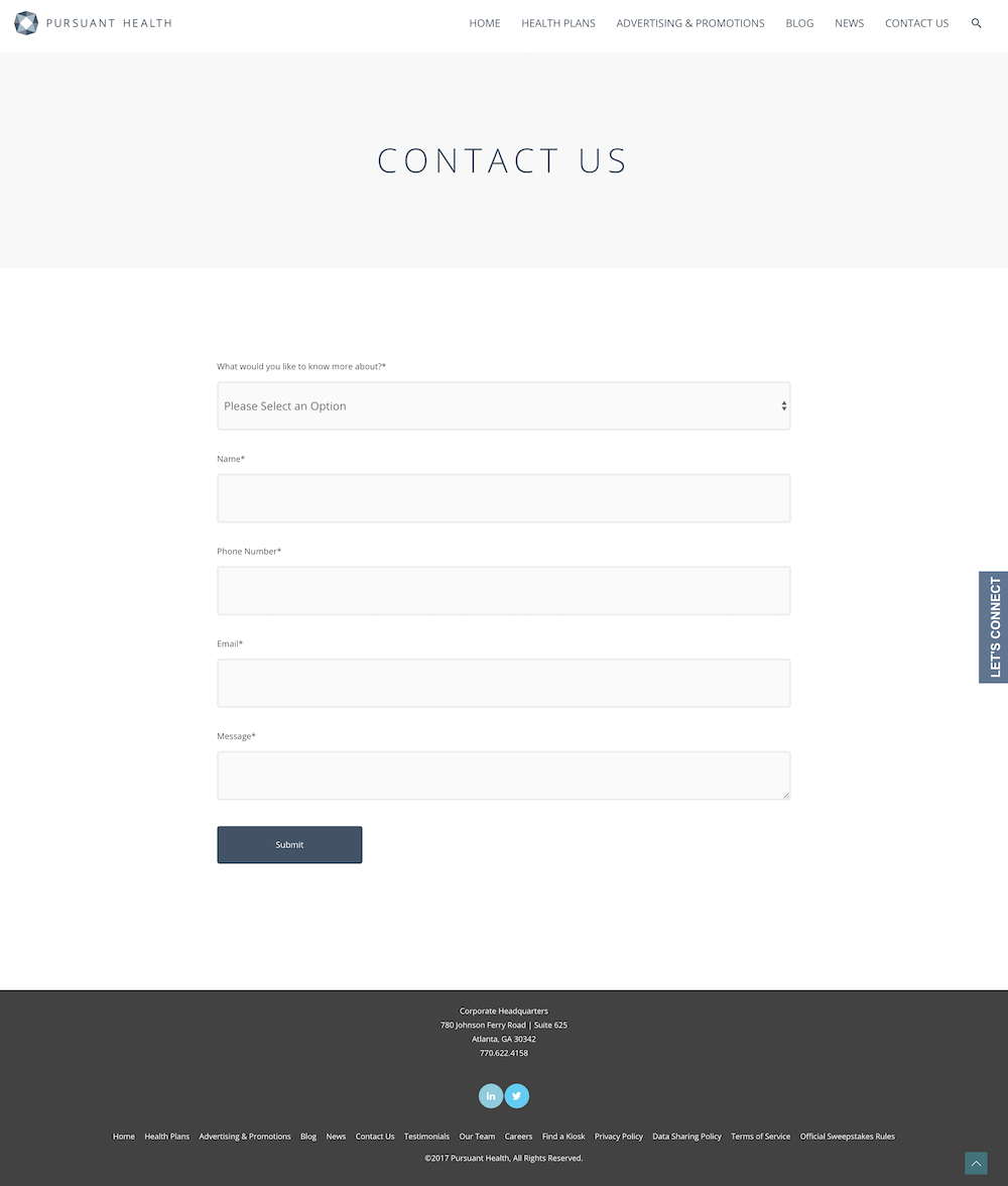
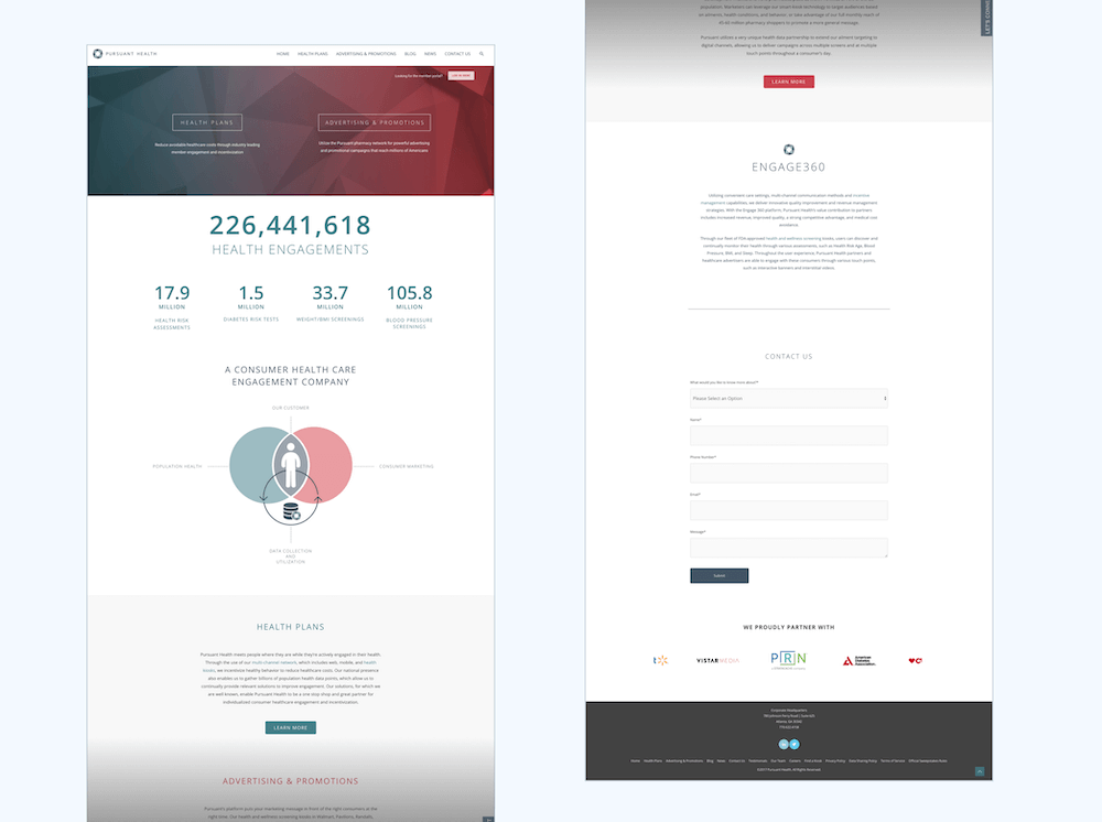
Before
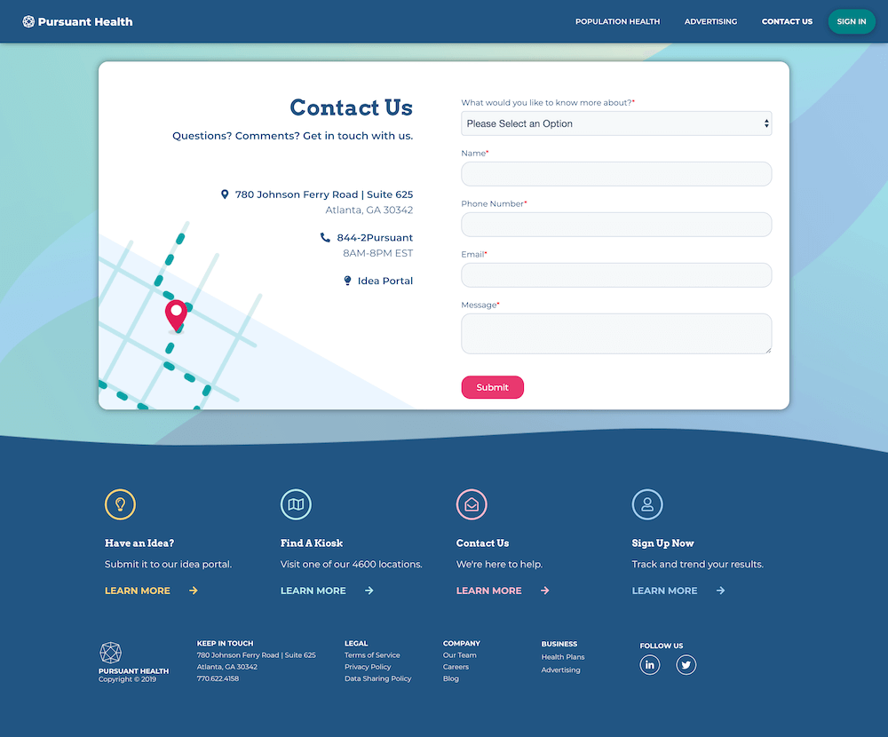
After
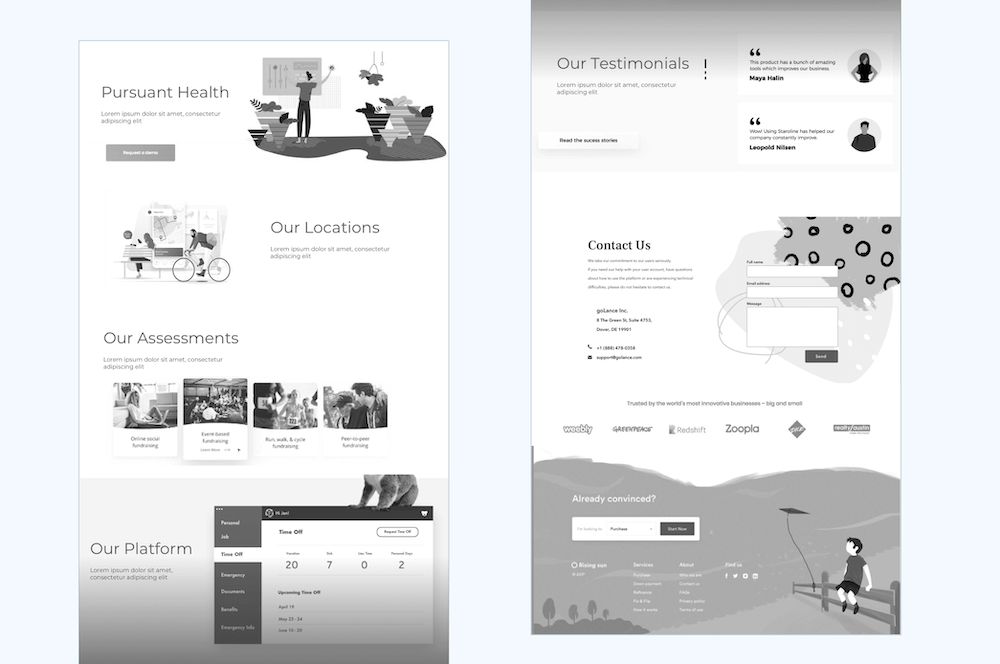
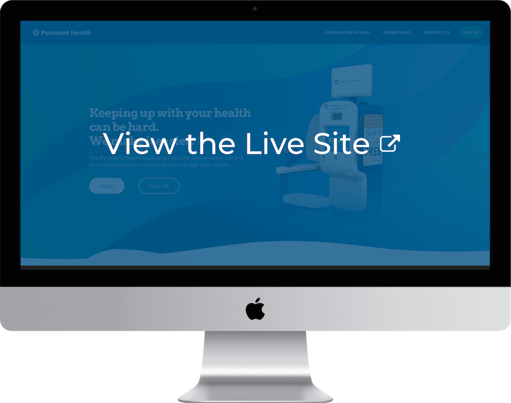
Our New Site
The new site is fast, user-friendly, and clearly explains what we do. Explore the live site below.
-
Table of Contents